It's Your Move
THE CHALLENGE
I was tasked with designing an online store for It’s Your Move; a local board game store, based in Denver. Their current online presence not only lacked brand identity, but in utility for users and an ecommerce platform as well.
Research
Competitive Analysis
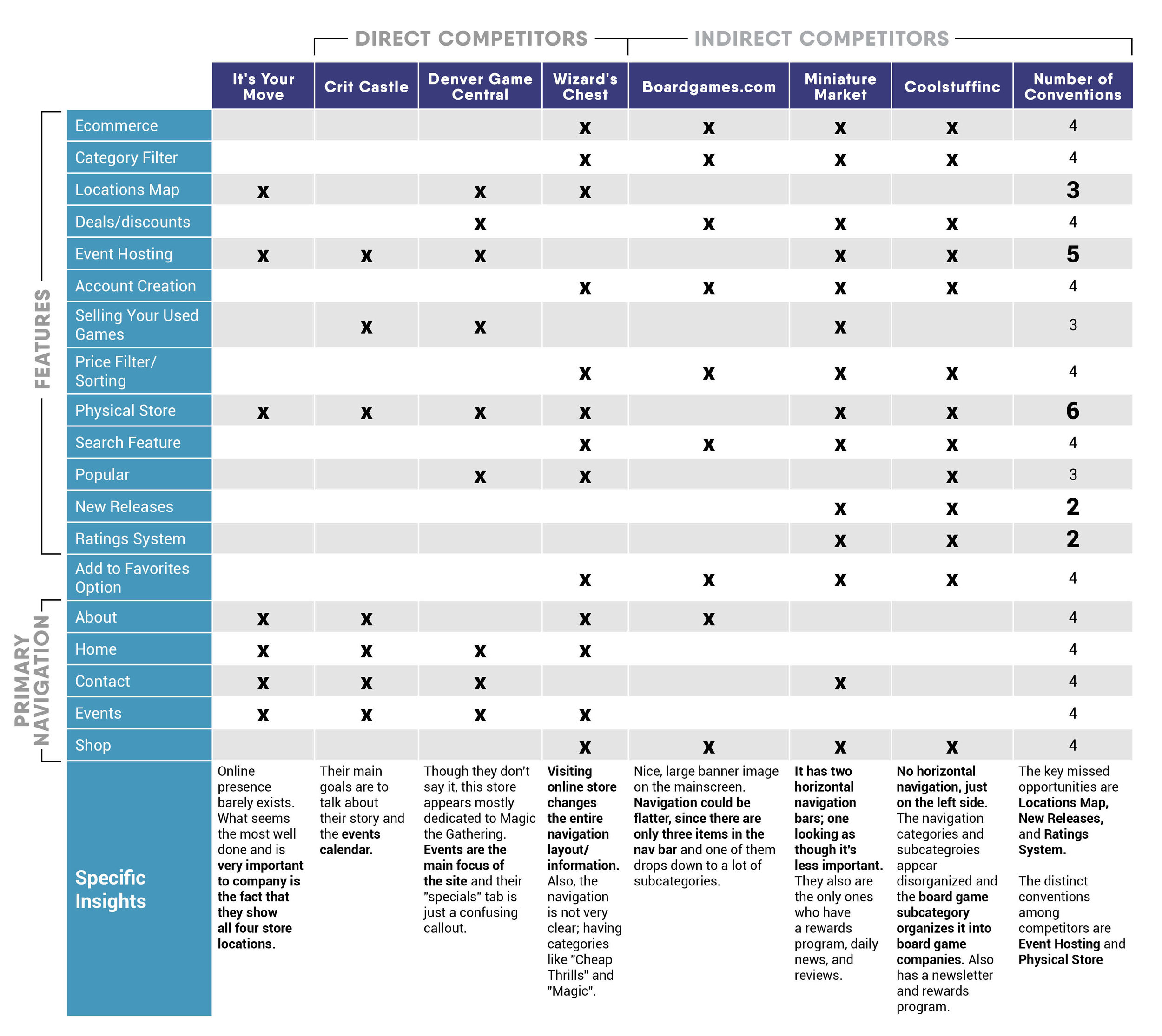
In order to first gain some insight into how other board game sales platforms’ conventions and missed opportunities, I first started with competitive analysis. When looking into board game ecommerce - as a whole - I found a lack of organization, intuitiveness for the users, and any sort of design consistencies.
Competitor Conventions:
Hosting of board game events
Having a physical store
Missed Opportunities:
New releases section
Ratings system
Store locations
User Interviews and affinity maps
Interviews were conducted with five different people; each with varying interests and knowledge of the board game industry. After collecting this information, I then created affinity maps which helped me to gain some distinct insights.
Key Findings:
People play board games as a form of escapism.
"Strategy" was most commonly used when describing board games.
Board games are bought in-stores or through Amazon, due to the confusing interfaces of board game websites.
More avid gamers rely on research and playtesting before purchasing board games while novice gamers typically rely on word-of-mouth.
People enjoy the social and tangible aspects of board games (vs. social media or video games).
Personas
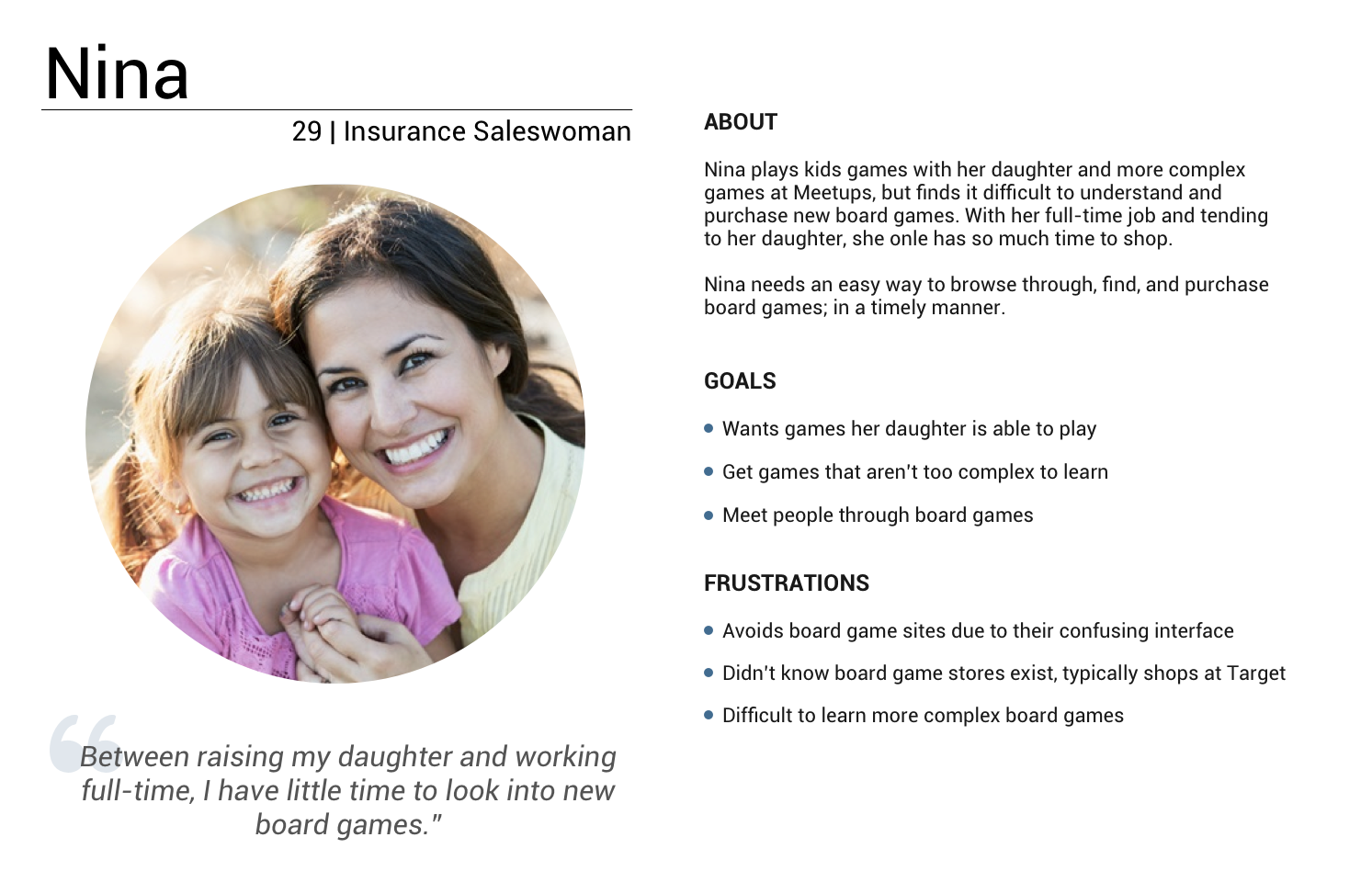
After user interviews and affinity mapping, I came to the conclusion that there are two distinct user personas: the experienced, research-driven player and the word-of-mouth, novice player.
Information Architecture
user FlOWS
Being that she's newer to board games and has limited time, Nina may just see the current best seller - shown on the home screen - and go straight to that. Brad knows exactly what type of game he wants, so he will rely more on specific categories and filters.
card sorting
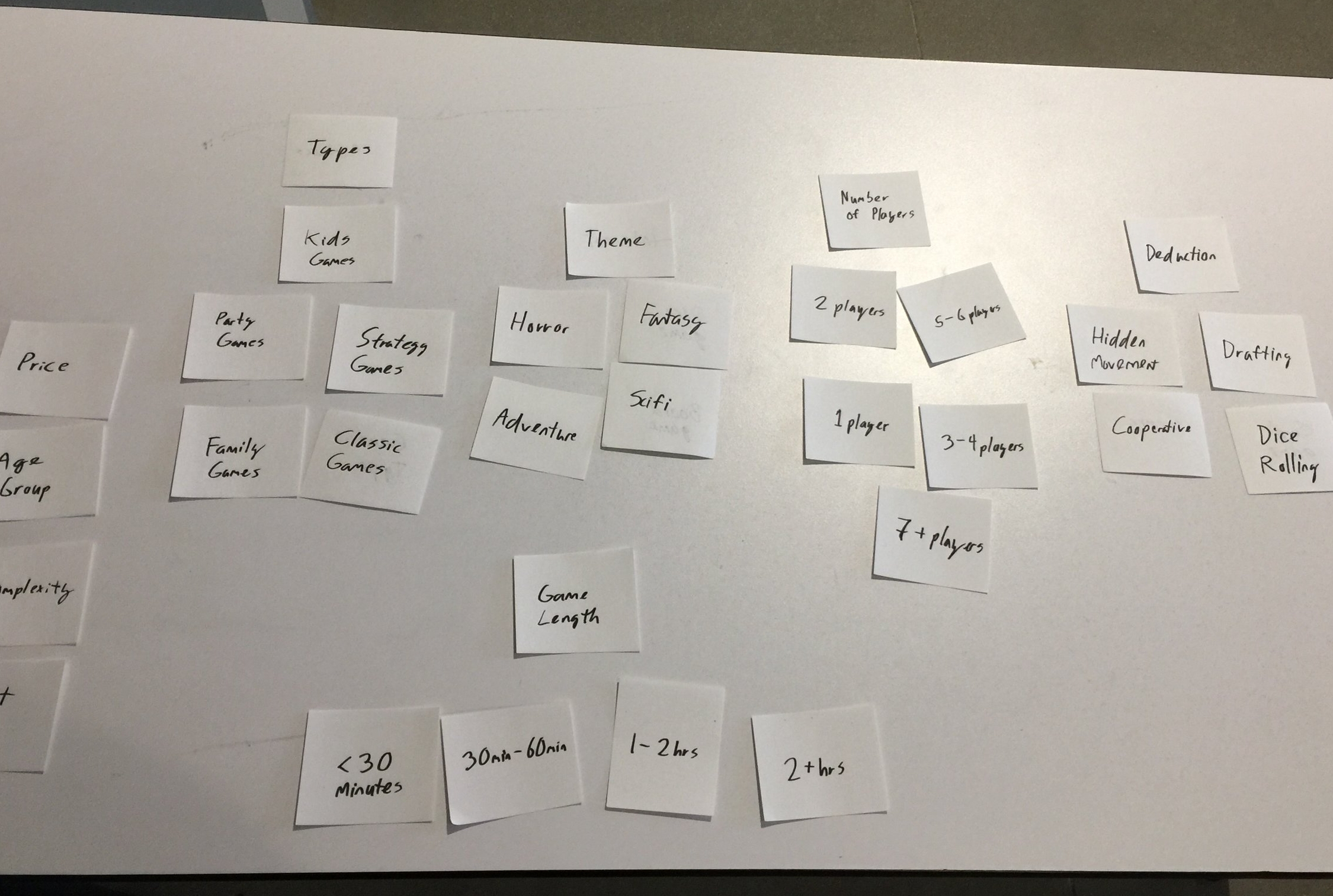
Card sorting helped me to better organize the primary navigation as well as what was expected from filters and sorting options.
Key Findings:
More novice gamers didn't know what "mechanics" entails.
Location information was expected to be under contact information.
Site Map
During the process of organizing and card sorting, I discovered that the navigation would need to heavily rely on filters and sorting.
Prototyping and Usability Testing
Early Wireframe sketches
The purpose of these sketches was to help me get an idea of where items should be laid out on the page, before moving to digital wireframes
digital Wireframing and iterating
After designing low fidelity wireframes for the two different personas’ flows, I ran multiple usability tests through InVision.
Key Findings:
Looks a bit busy at the top, with the secondary navigation also shown
Could be clearer, where you are on the site
Show ratings with all product thumbnails
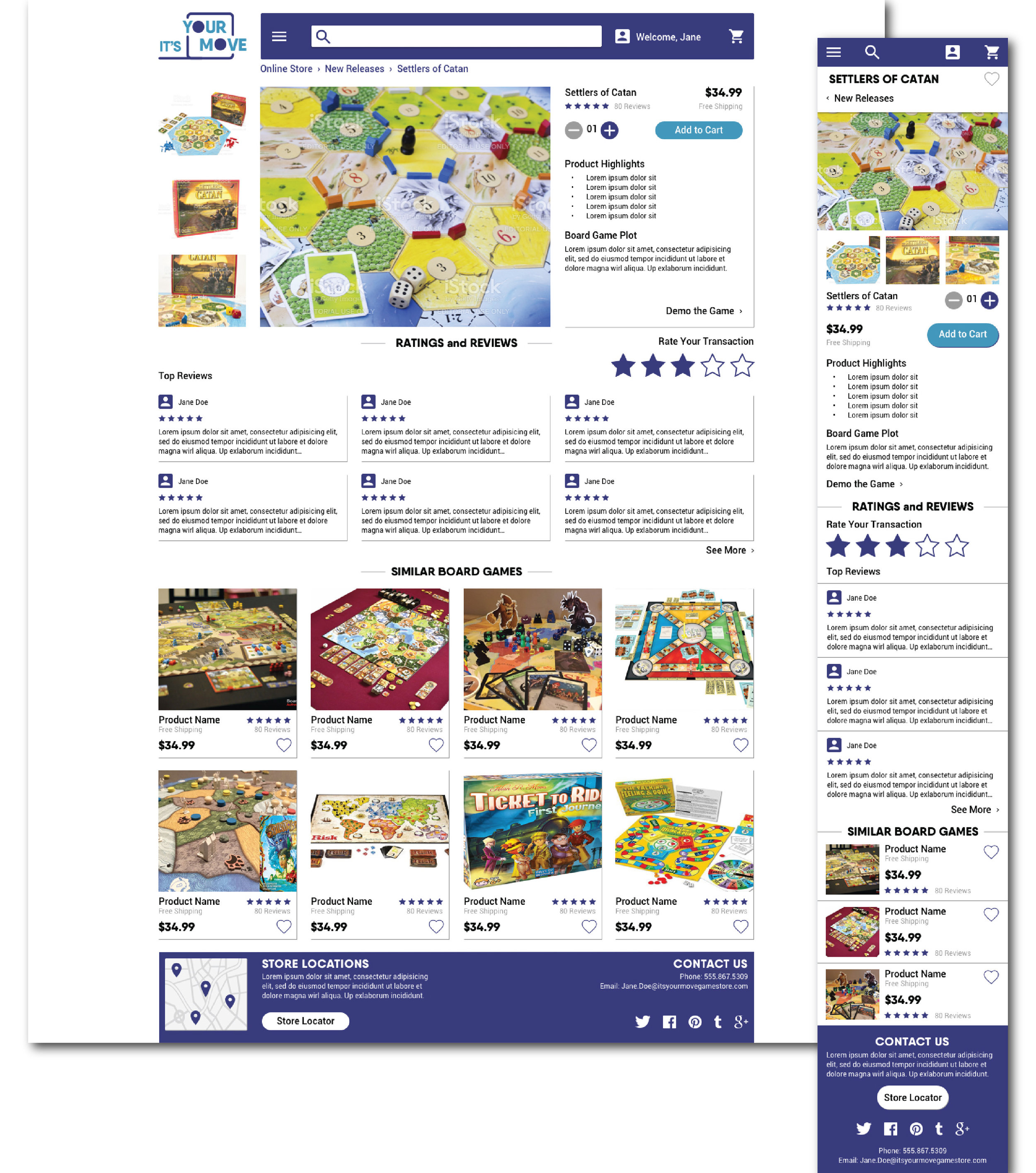
The "reviews breakdown" on the product page is unnessecary and could be lower on the page
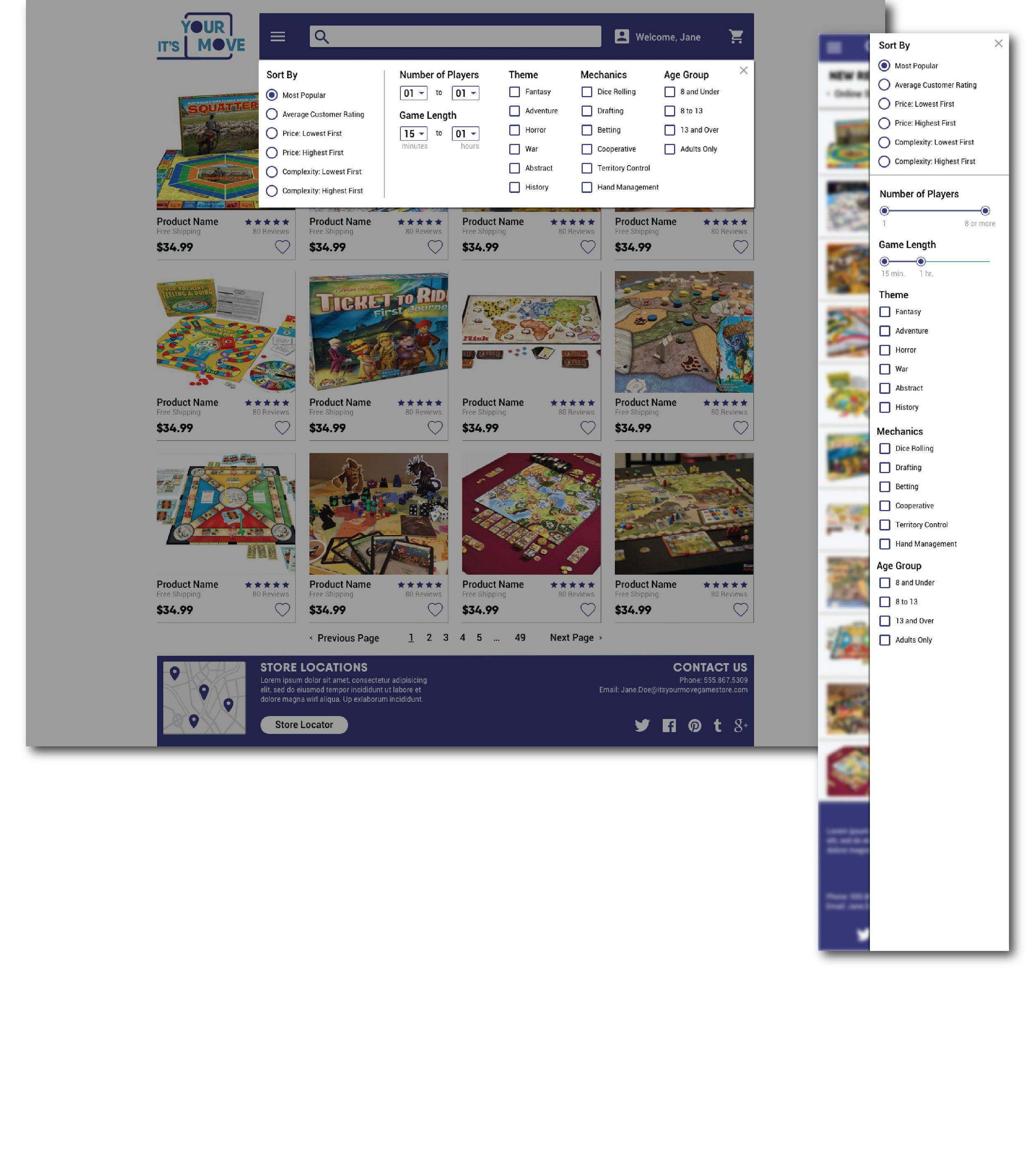
Treatment of the sorting and filters looks “awkward”
Logo Redesign & A Slight Rebrand
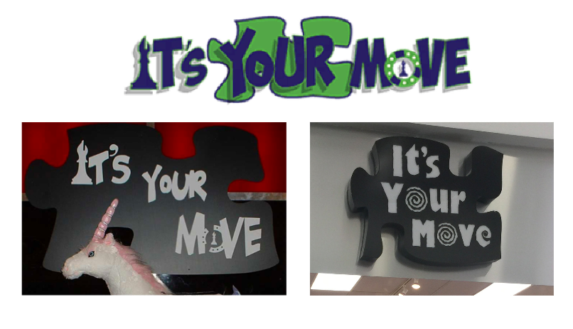
The company had very little brand consistency, (with their logo, color scheme, and typeface) and needed a refresh! I designed a logo, typeface, and color scheme that has a more modern, fun feel.
BEFORE
After
Final Design
Website Redesign for Responsive Web
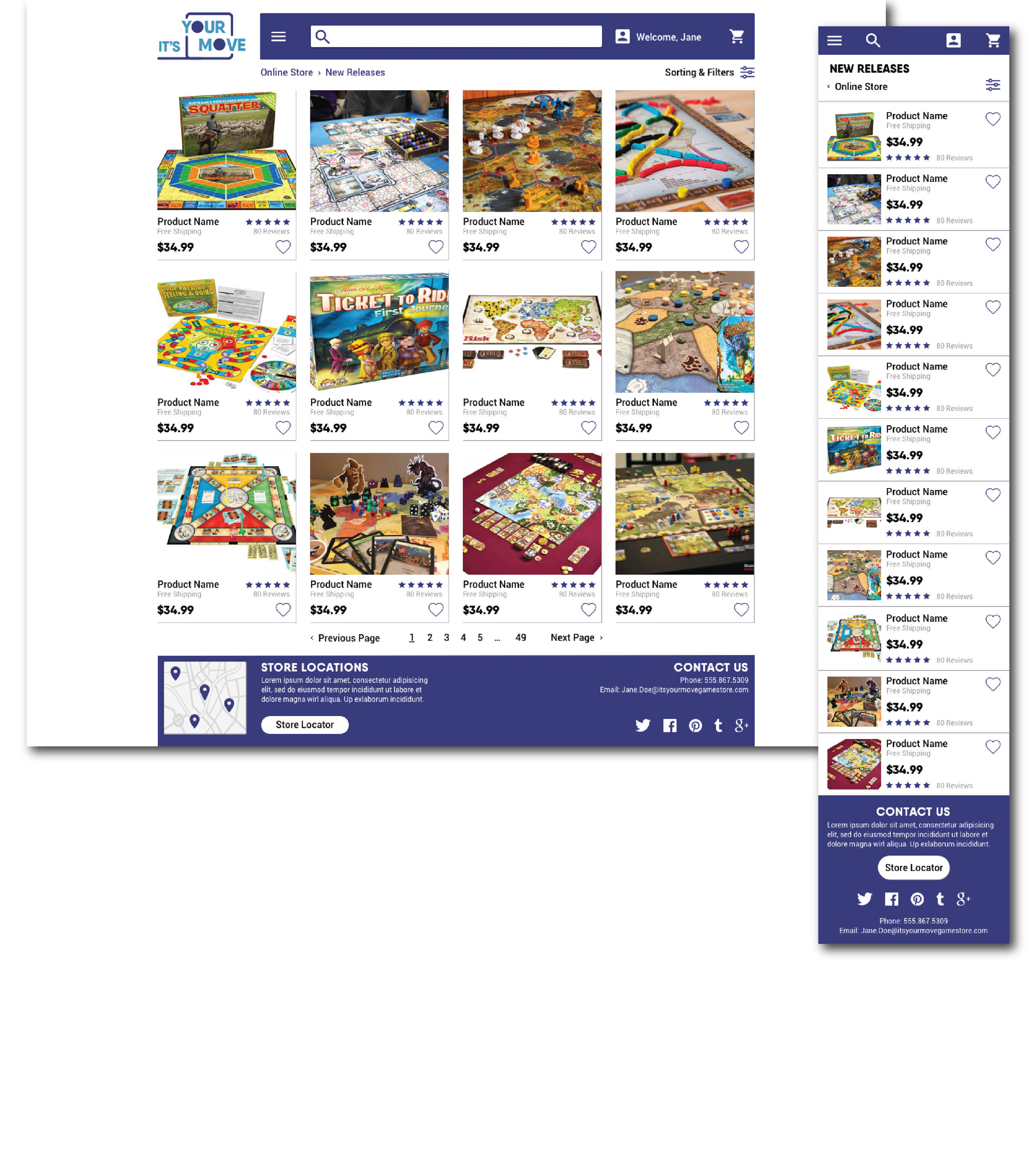
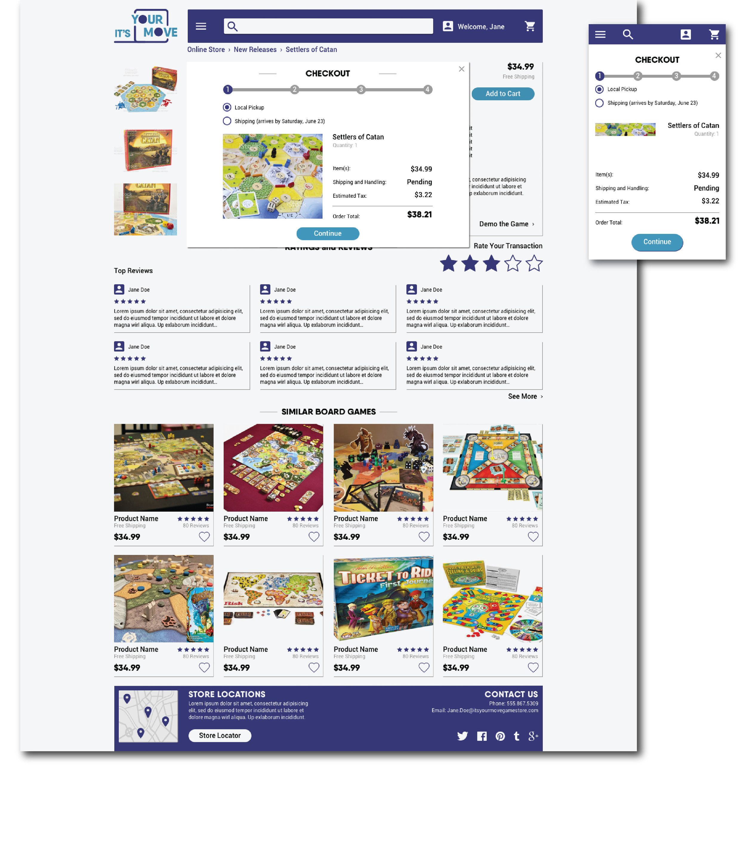
Given previously stated insights, I created a final interface for high fidelity wireframes for a responsive website that better addressed board game hobbyists’ needs. The final design is a more simplistic layout; having the most important items immediately accessible to loyal board gamers and curious shoppers alike. All other necessary navigation elements are housed within the hamburger menu.


