ROI Calculator Redesign for StandLogix
The Challenge
The scope of this project involved redesigning our client's Return on Investment (ROI) calculator webpage, in order to increase customer engagement. My secondary motive became creating an organized design system for StandLogix. I had one partner with this project, who acted as the product manager, while I managed the design system and UI design.
StandLogix is a B2B company that created the "Fitbit" for standing desk users. The company's goal is to sell their StandLogix devices to other companies with standing desks, so as to help them encourage their employees to stand more. The ROI calculator is designed as a selling point, by showing how a company that invests in these devices can save money by increasing employees' health and productivity.
Research
standlogix gave us a jumpstart...
The client supplied us with a brief of research that had already been done on their end. StandLogix had also ran a pilot program with their product, so there were some great insights derived from that.
Some of these items included:
- Company background information
- Direct sales targets
- Channel sales/partners
- Business objectives for the project
- Direct competitors
- Target personas
StandLogix also gave us a link to Apprenda, another ROI calculator that the CEO said he wanted: "to emulate as it’s nearly exactly what I want the re-designed calculator to look/feel/function like". This is not to say that there was definitely room for improvement...
user flow
Given the information supplied to us, I quickly created a user flow for the StandLogix team to use for the ROI calculator. The company's main business goal was to create a dialog between StandLogix and the user, so I wanted to have the contact form available from both pages of the ROI calculator.
Persona Creation
After reading through the research supplied to us, I created a persona for the target audience of their ROI calculator.
card sorting
My partner and I conducted card sorting with StandLogix's old ROI calculator with two people in HR, two in upper management and one in finance. With these tests, we discovered four input fields that they all agreed should be in the calculator.
The four input fields:
- Number of standing desk users
- Average employee salary
- Average employee turnover rate
- Average cost per worker's comp. claim
The CEO of the company already supplied us with three of these fields that he wanted to include; the exception being "average cost per worker's comp. claim". We showed him our findings and, given his reasons, we decided not to include this field.
The CEO's reasons:
- Worker's comp. doesn't vary all that much within industries mostly working in office environments
- It has little impact to the overall savings, when calculating the ROI
- Wants the calculation to be as simple as possible, so people can contact the company for specifics
Company's old ROI calculator for desktop.
Design
Wireframes & usability testing
Once I had a direction, I started sketching and brainstorming webpage layouts. I then started designing the webpage for mobile screens first, since the client wanted it to be a responsive design.
The original wireframes were meant to consolidate a separate page called "ROI Support Page" into the ROI calculator page, on the client's website. After usability testing we gained a lot more insights and potential improvements.
Company's old ROI calculator
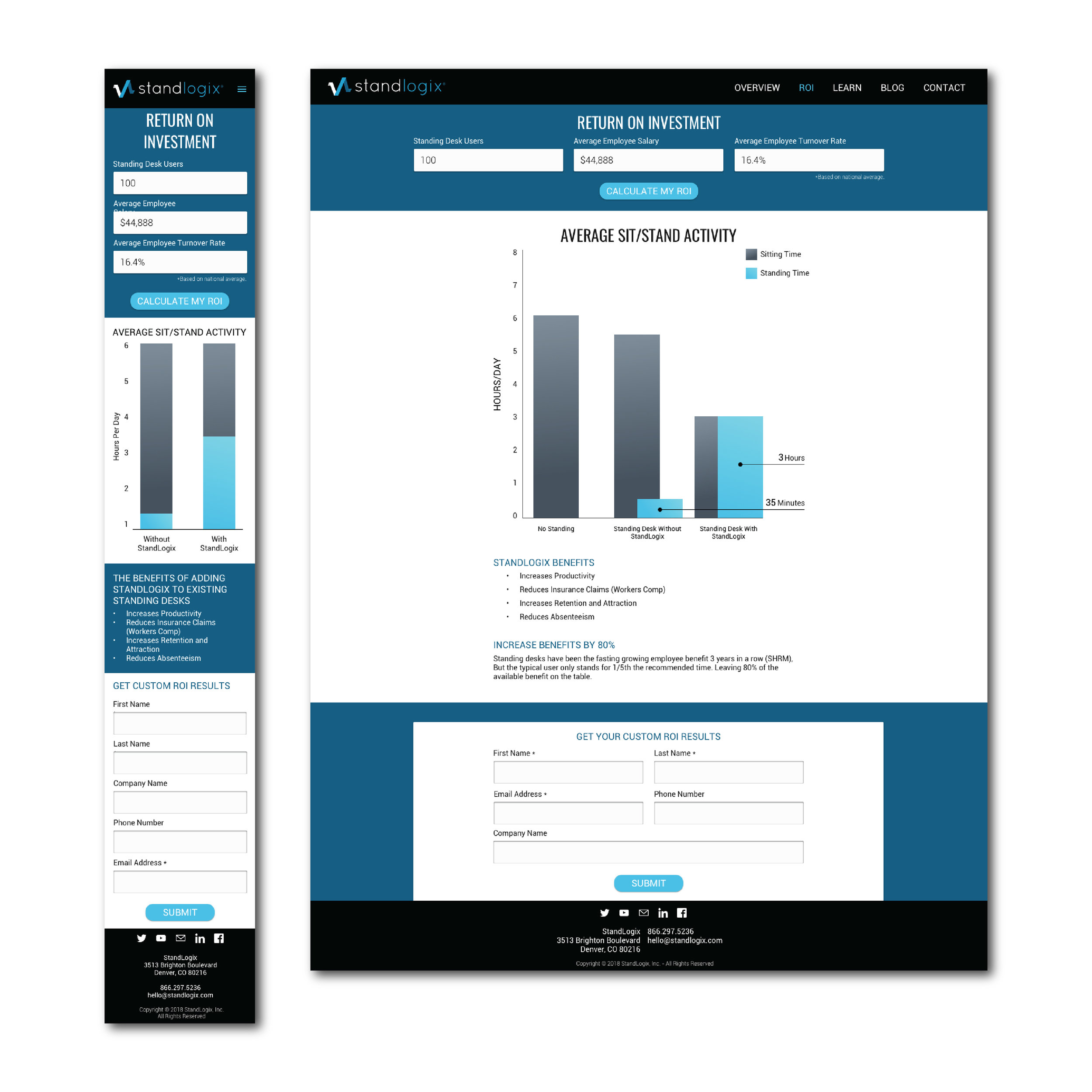
Page one of the updated ROI calculator
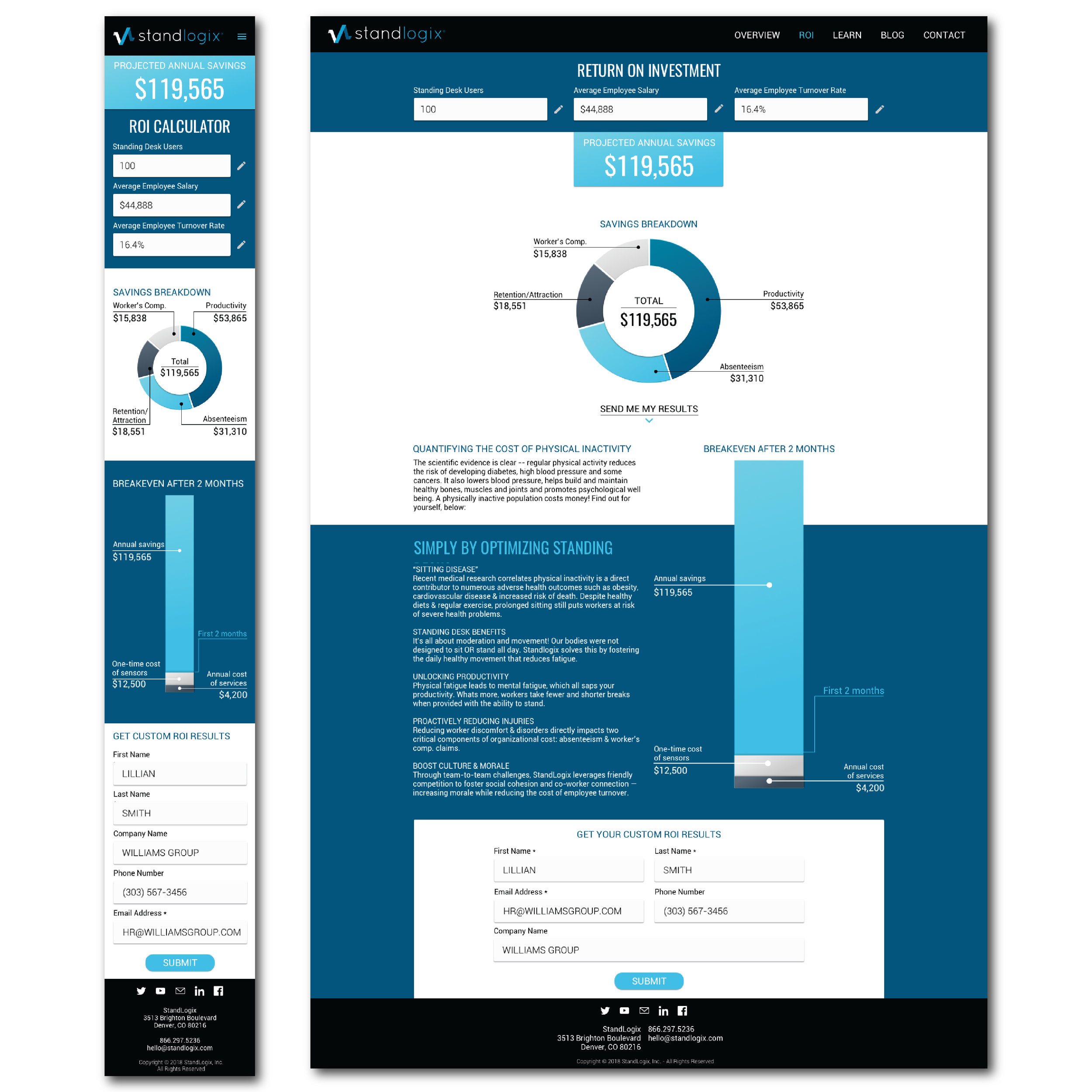
Page two of the updated ROI calculator
Key Findings:
- Too much textual information
- The Free Consultation seems "sketchy"
- The input fields should be at the very top
- The data visualization was updated from the company's original charts, but still considered to be "unclear" and "outdated"
- Improvements to the overall copy is needed as well.
creating a Design system
You may be wondering why the wireframes shown above were pretty high fidelity. This is because the scope of the project was quite narrow, compared to another team that was simultaneously working with this same client. I was creating the design system throughout the process, so the other team could also use it; creating one cohesive brand for both projects.
data visualization
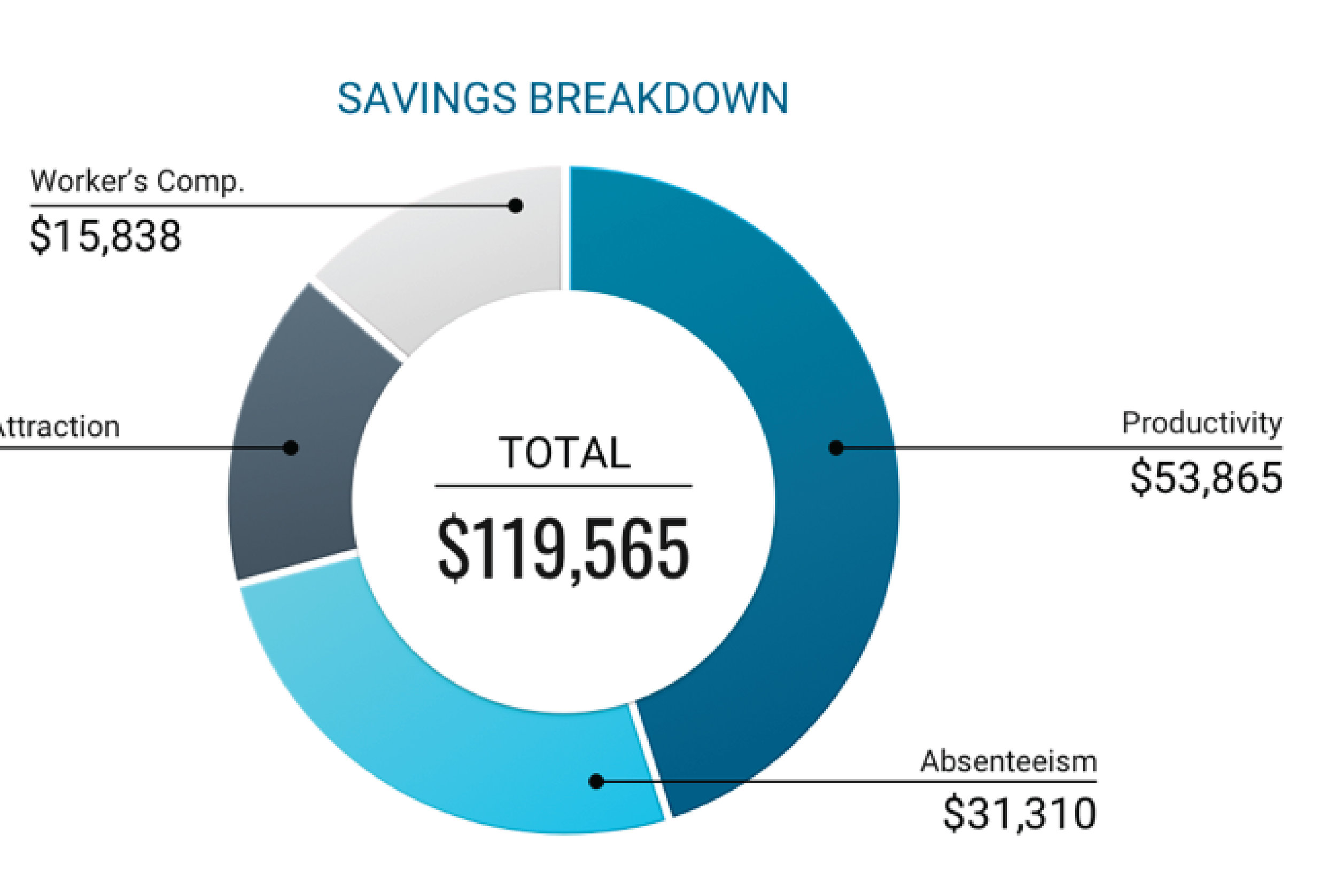
A large part of this project became about data visualization. We needed to convey their information more clearly, through visuals. After talking with the client and doing extensive usability testing, I decided that a lot of the body copy could be translated into charts and graphs. This would help increase customer engagement and make it easier to read through for users.
One of the main problems that our client had was conveying how sitting and standing times, throughout the day, happen in sessions. I designed an animation through After Effects in order to better demonstrate it.
Through usability testing, we actually discovered that demonstrating how sitting/standing happens in sessions wasn't a concern among any of the users and we decided it was best to scrap the idea entirely. Shown below, is the final animation I designed; just to add a little bit of delight to the user's experience.
Final Desktop and Mobile Mockups
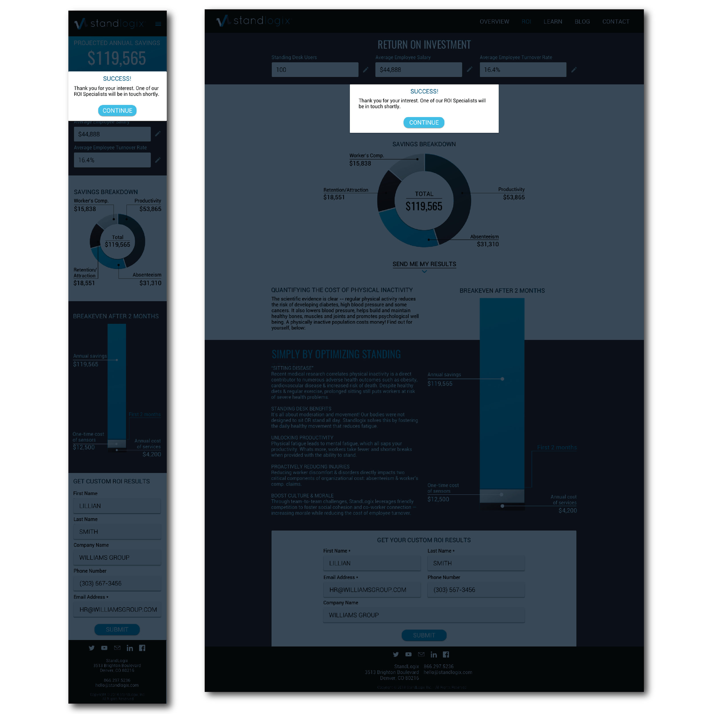
After all was said and done, I designed the final user interface for every screen throughout the ROI calculator process; meeting the client's goals and the users' needs. When moving from desktop to mobile some secondary copy was removed, layout adjusted, and charts slightly altered (while still conveying all pertinent information). If you continue to the bottom of the page, you can try the prototype for mobile.
Try It Out For Yourself!
Scenario
Remember Lillian, the HR manager persona from earlier? Put yourself in her shoes and let's say you want to see how much your company can potentially save by investing in StandLogix.
Here are your steps:
- Put in the number of standing desk users in your organization, average employee salary, and average employee turnover rate (it'll just be one click to do this).
- Calculate your ROI.
- Get your custom ROI results by filling out the form (just one click).
- Submit your information and your done!
