
Careers Page Redesign
company background
HomeAdvisor provides homeowners with tools and resources needed to complete their home improvement, maintenance and repair projects. Being that HomeAdvisor is a well-established brand with a large presence in the home improvement services sector, they needed a careers page to be up to par with the rest of their website.
The Challenge
What started as: “refreshing the look of the HomeAdvisor’s current careers page”, became redesigning the entirety of the HomeAdvisor careers website. HomeAdvisor had a careers website that was thrown together; including very little information about the company’s culture, benefits, departments, etc. Most links on the website simply sent the user to UltiPro; a third-party platform used for searching and applying for jobs.
Research
Reviewing the original careers page
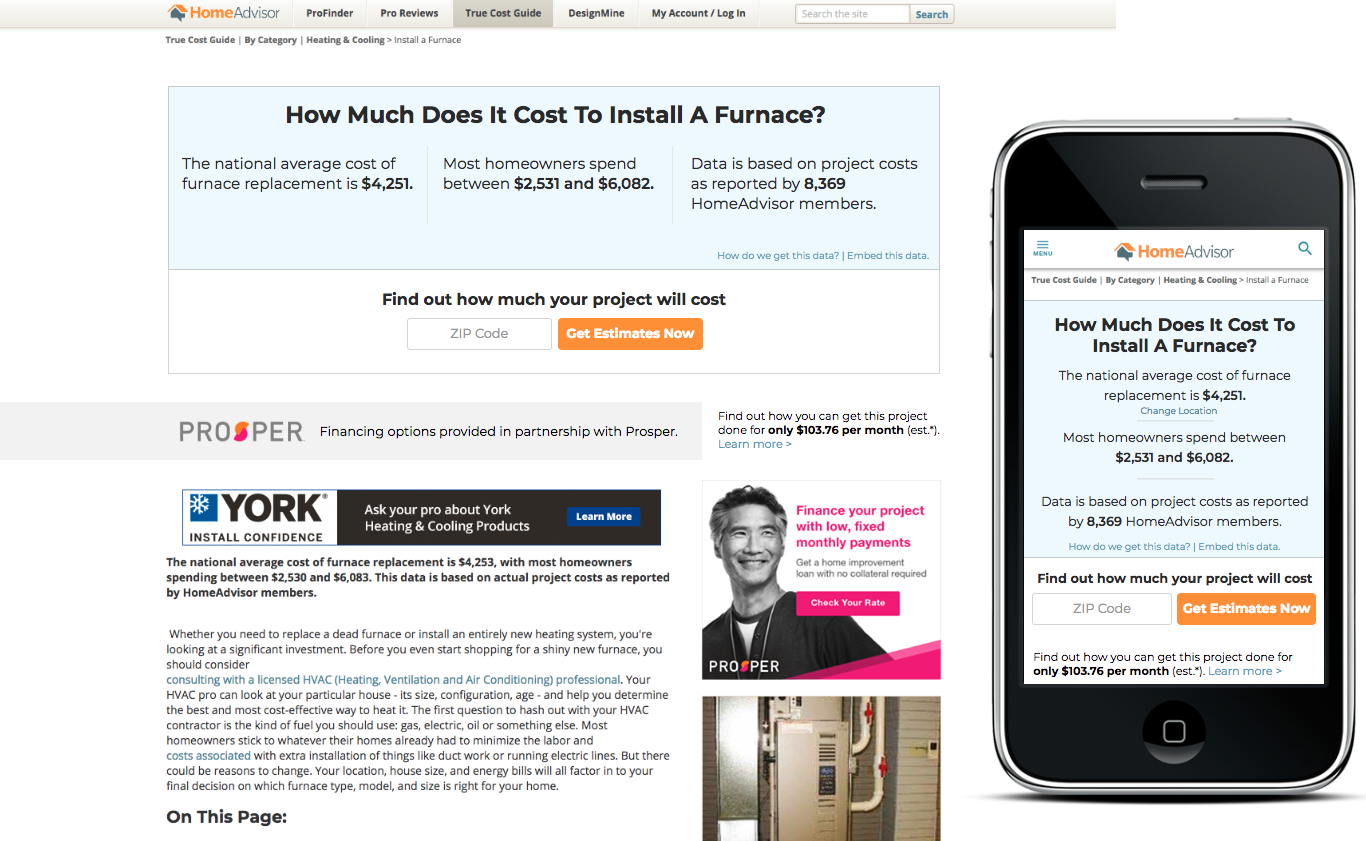
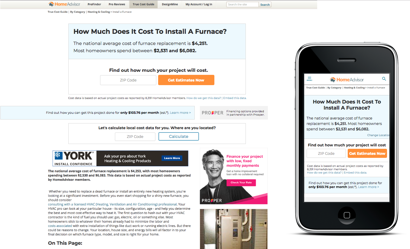
I first started by looking through all the pages attached to the original HomeAdvisor careers page and taking note of everything it included at the moment. This was so I would have a basis for starting competitive analysis. You can see the original careers page below:
Website on desktop
Website on mobile
COMPETITIVE ANALYSIS
HomeAdvisor found themselves losing out on new, talented software developers to bigger tech companies in cities like New York City and San Fransisco. This is why the project started as making a more appealing landing page that would pull people to our Colorado, Chicago, and other offices. I first started by looking into some of the highest rated careers pages on the web; most of which were tech companies.
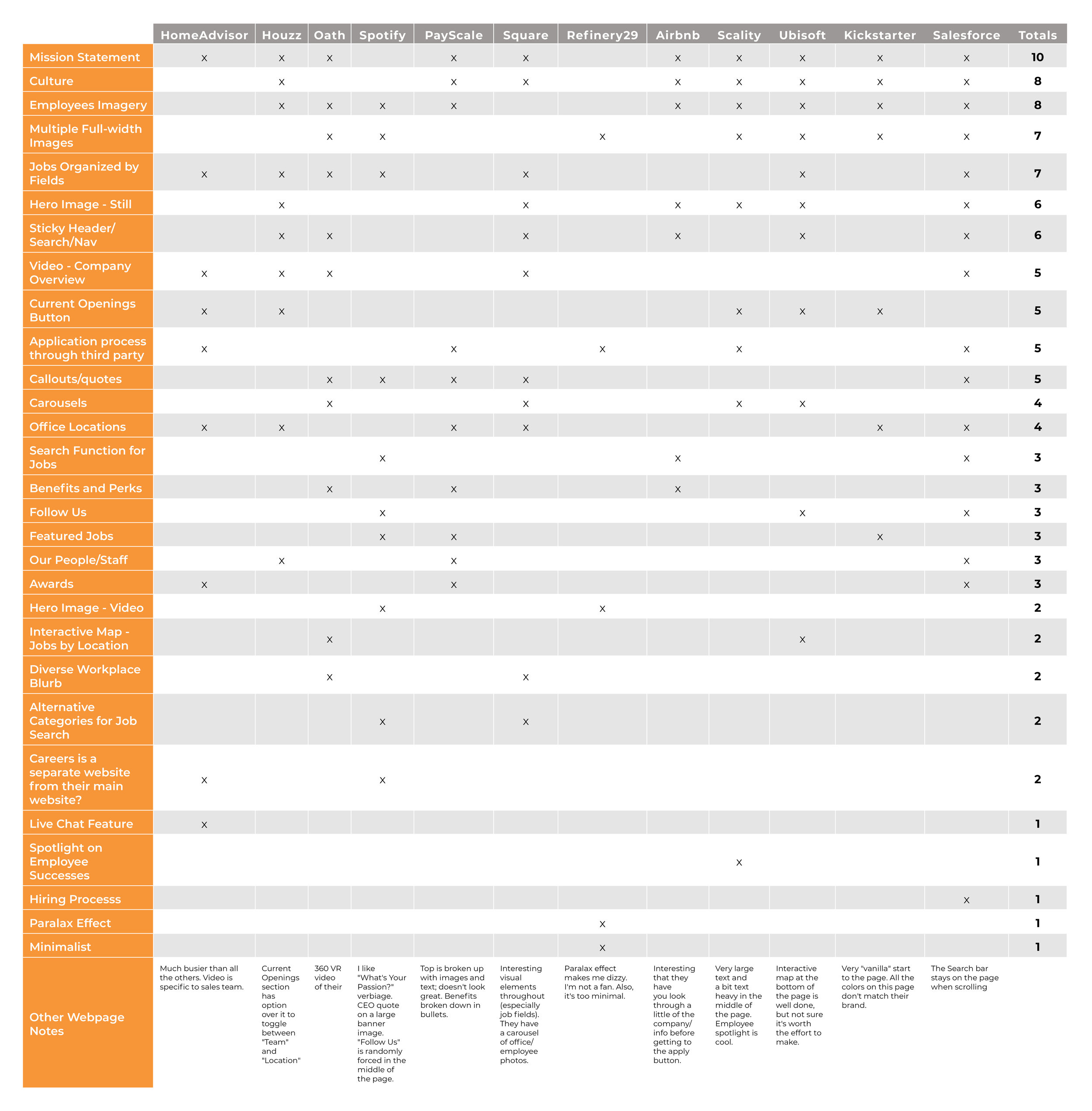
Competitors’ Conventions:
10/12 of the sites had a mission statement close to or at the top of their careers landing page
10/12 of the careers pages were subdomains of the company’s websites
The majority of the sites had lots of large photos depicting employees and their office spaces; typically starting with a full-width hero image at the top
Majority of the sites spoke about their culture on the first page.
The majority of the sites had locations and jobs organized into categories on their page, as well as having the options to search for either field in some other manner.
Potentially Missed Opportunities:
Only a couple of the sites had video on their careers page, and it seemed to grab peoples’ attention when looping video was used as the hero (Spotify did this).
Very few sites spoke to how they hired and their hiring process.
Only two of the sites had an interactive map for locations and they were both larger, global companies
Few companies mentioned their awards on the page
Few companies mentioned anything about benefits/perks on the first page
Design
Low-fidelity wireframes
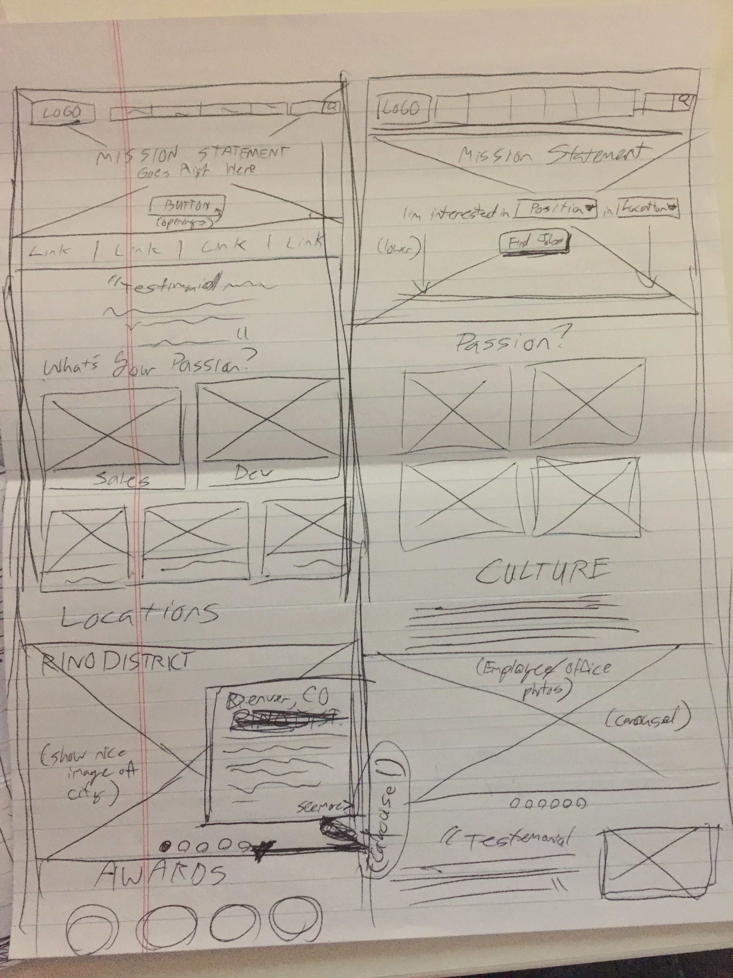
Now that I had a direction to go after speaking with the Project Manager (PM), the Vice President (VP) of Product (one of the main stakeholders), and conducting extensive competitive analysis, I jumped right in to sketching. Though I would usually start with mobile web, the VP of Product wanted to start on desktop since it was more commonly used and they wanted to get something out there as soon as possible. These sketches were helping me to prioritized items that were most common within competitive analysis, as well as to get a better idea of the appropriate layout for the landing page.


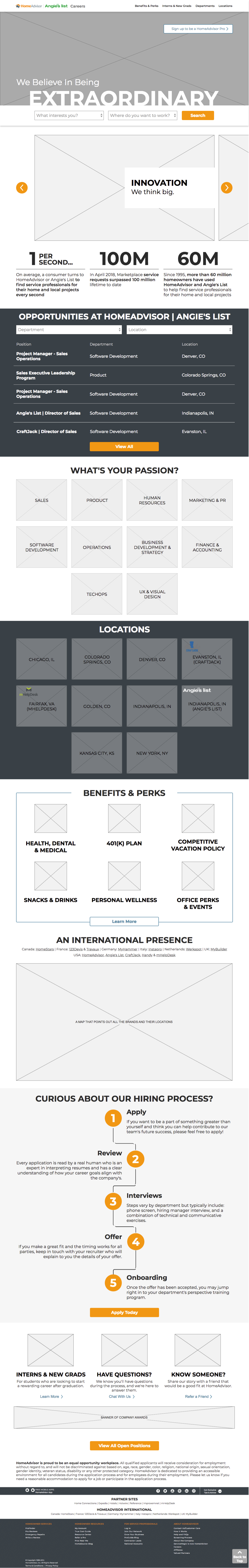
Once I found a few different potential treatments for the careers page, I started designing them through Axure. I wanted to give the PM an idea of how the items could be organized on the page and how the different interactions may work. She setup a meeting with the VP of Product, who requested that I push the fidelity higher to give an idea of the potential imagery used and how branding the page may work. Part of this request had to do with how we might approach co-branding HomeAdvisor and Angie’s List, since both companies were using the same careers page.
Key Takeaways:
VP of Product wanted to see an interactive map that would show our international presence
VP of Product didn’t want information about different office locations on the main page, because he thought it was too much information
PM thought the toggle feature for locations and departments may add one too many clicks to the user experience
VP of Product mentioned that the “core values” or “mission statement” pieces would be too specific since we were promoting two different companies with different cultures
Preferred a search feature at the top instead of a “Current Openings” call-to-action (CTA) button.
Wanted to see higher fidelity mockups with brand colors, photography, typefaces, and what the copy may be
scope creep
After pushing the fidelity higher, we presented the mockups to HR and PR. They mentioned how culture, perks, etc., changed office-to-office; department-to-department. This is when it was brought up that we may need to build out separate pages for these different items.
Key Takeaways:
Wanted pages for the locations and departments, so we may better speak to their specific culture and perks
PR requested other stats to display than revenues and percentages
HR had questions about student recruiting and wanted a page to speak to this, specifically
The Big Pivot
i realized we may need to take a couple steps back…
I started updating the main page as well as building out what the attached pages may look like for different departments, locations, and for the students section. Then we had another meeting with the VP, Marketing, PR, and HR. This is when the everything really blew up… You can see the designs I walked them through, below:
Key Takeaways:
PR had questions about how this would work on Wordpress, because the current “abouthomeadvisor.com” site was on Wordpress (so PR could update pages on a daily basis)
There were lively debates over co-branding with Angie’s List and HomeAdvisor, or using the parent company (ANGI Homeservices) brand for the entire site
Marketing had questions concerning using employee photos if they quit or were fired
It was then brought up how HomeAdvisor also owned other companies, (CraftJack, mHelpDesk, HomeStars, etc.) who went through our software to find jobs, and how we could show their brands on the site
Potential changes to the entire architecture of the site was also brought up, questioning the current top level navigation; careers, media resources, investor relations.
STEPPING BACK FROM PROTOTYPE TO DEFINE
Being that this was turning into redesigning the entire site and maybe even building out a separate site all together, I did some more competitive analysis and with that; proposed a new sitemap to the VP and PM. Below, you’ll see the original sitemap and my proposed changes:

The red items of this show what pages I was proposing we keep separate from “homeadvisor.com/careers”.
My Proposal:
I proposed that we kept the abouthomeadvisor.com website on Wordpress, so PR could still update it whenever needed
I then proposed taking the careers section out of the site and building it all within a subdomain: homeadvisor.com/careers
After looking into other companies like Google and Facebook, I also proposed that Angie’s List, CraftJack, and mHelpDesk should each have their own (much simpler) careers pages, but all going through the same Ultipro for applications
I pushed back the fidelity some to avoid menial questions pertaining to things like photography

This was my proposal for the careers page redesign sitemap along with the sitemap, and the footer would link through to “abouthomeadvisor.com”.
Moving Forward:
Abouthomeadvisor.com and careers would be separated and links between them would be within their footers
Angie’s List and the other child companies would have their own pages, but within the homeadvisor.com/careers page
I was told that the new company we’d work with (Greenhouse), for application and job searching software, we could have iframes within pages; showing some of the available openings
HomeAdvisor.com/careers
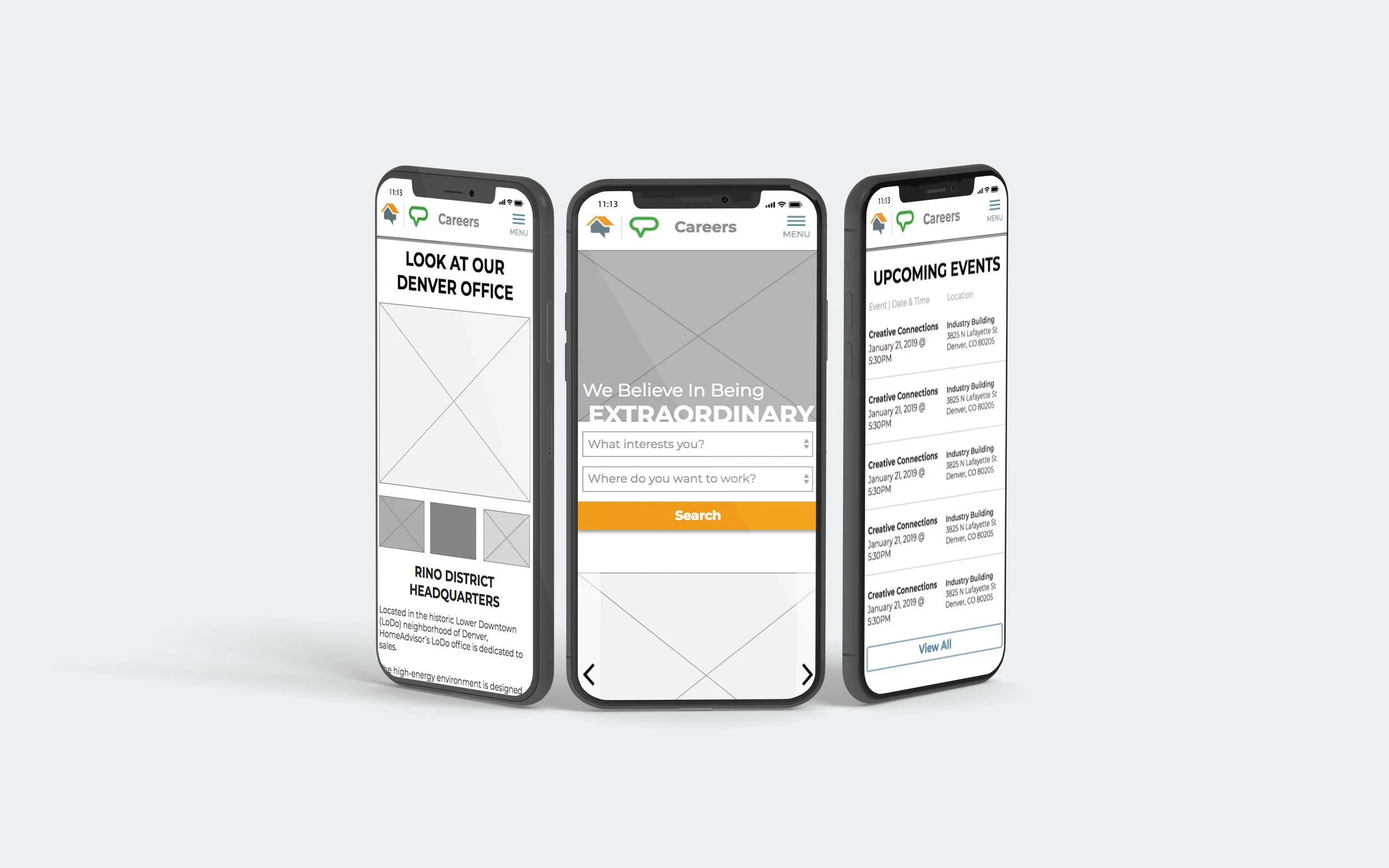
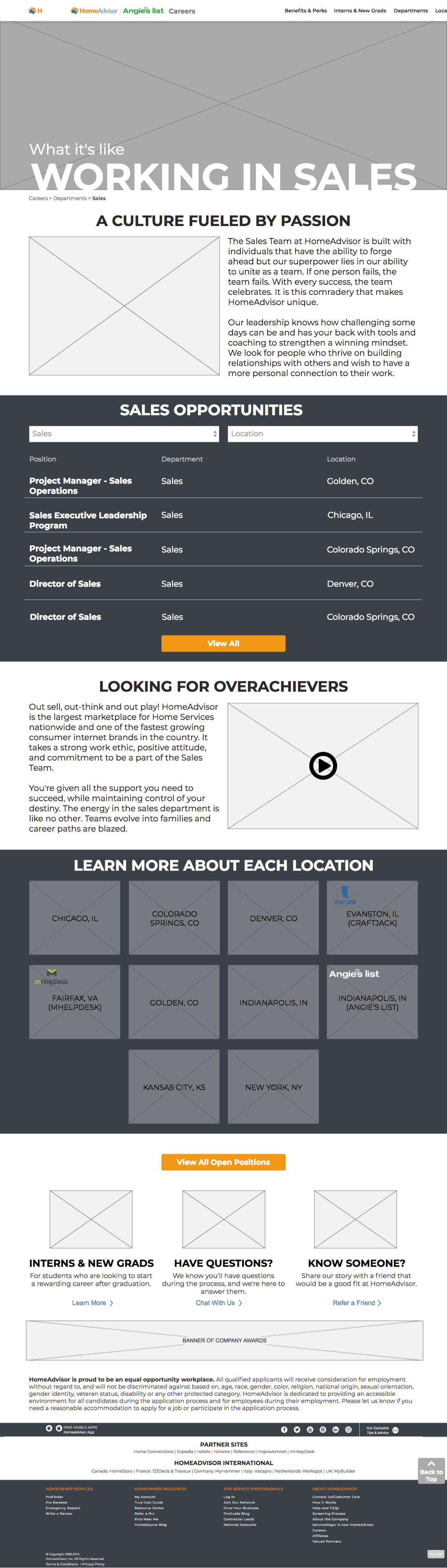
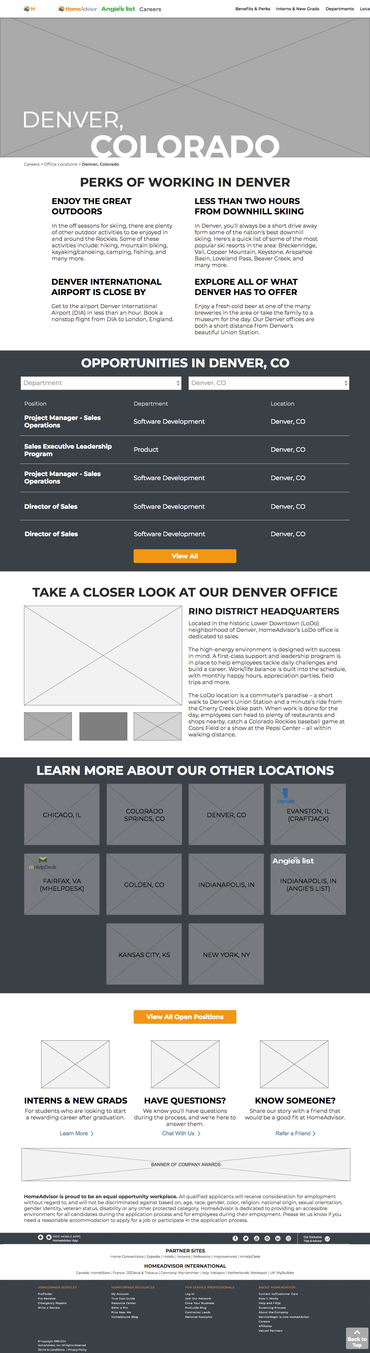
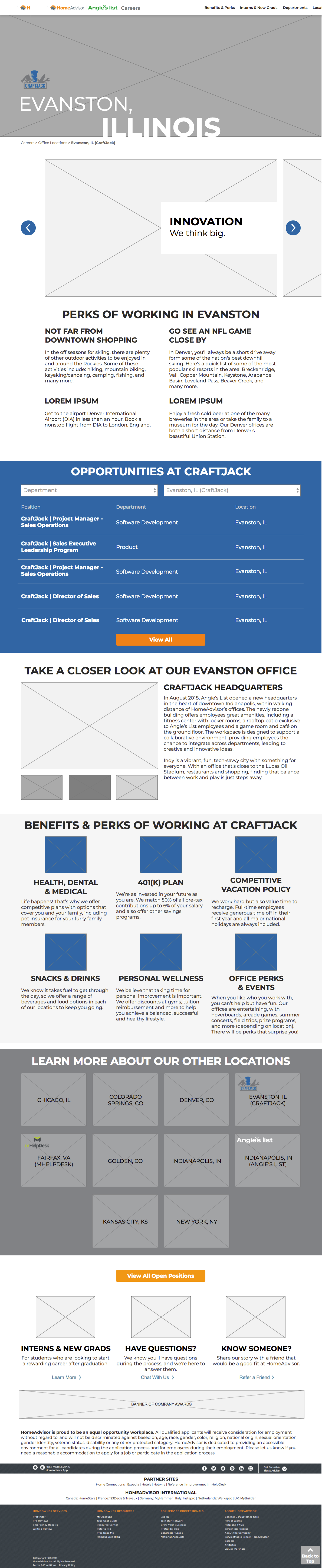
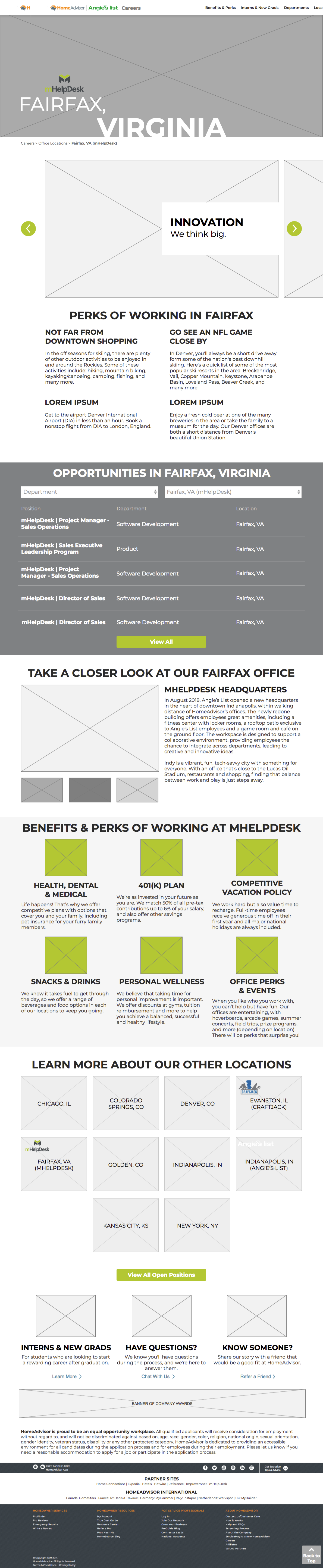
Once we decided on how we would move forward with the careers page and how we would include HomeAdvisor’s child companies on the same careers site, I built out pages for how they would look. I also pushed the fidelity back some, so that there would be less questions about the photography and other less pertinent items. You’ll see these wireframes, below:
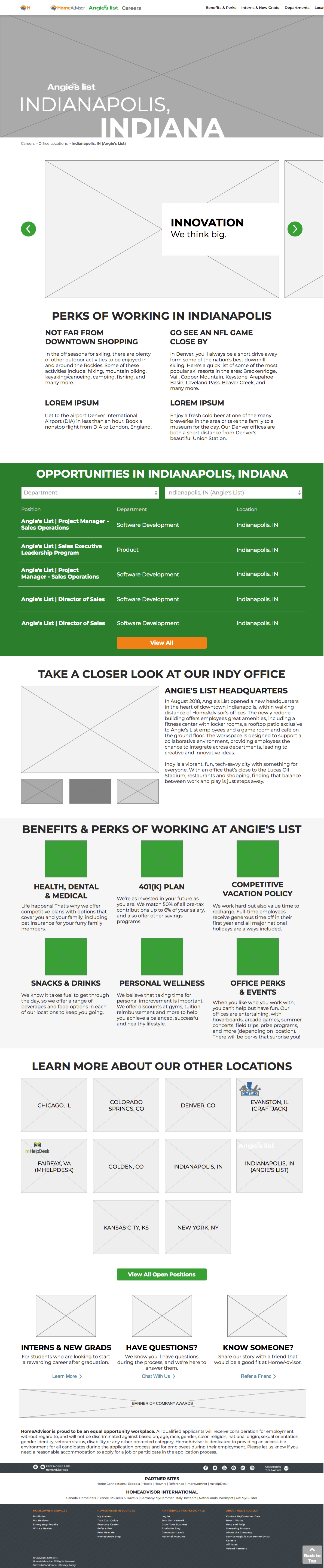
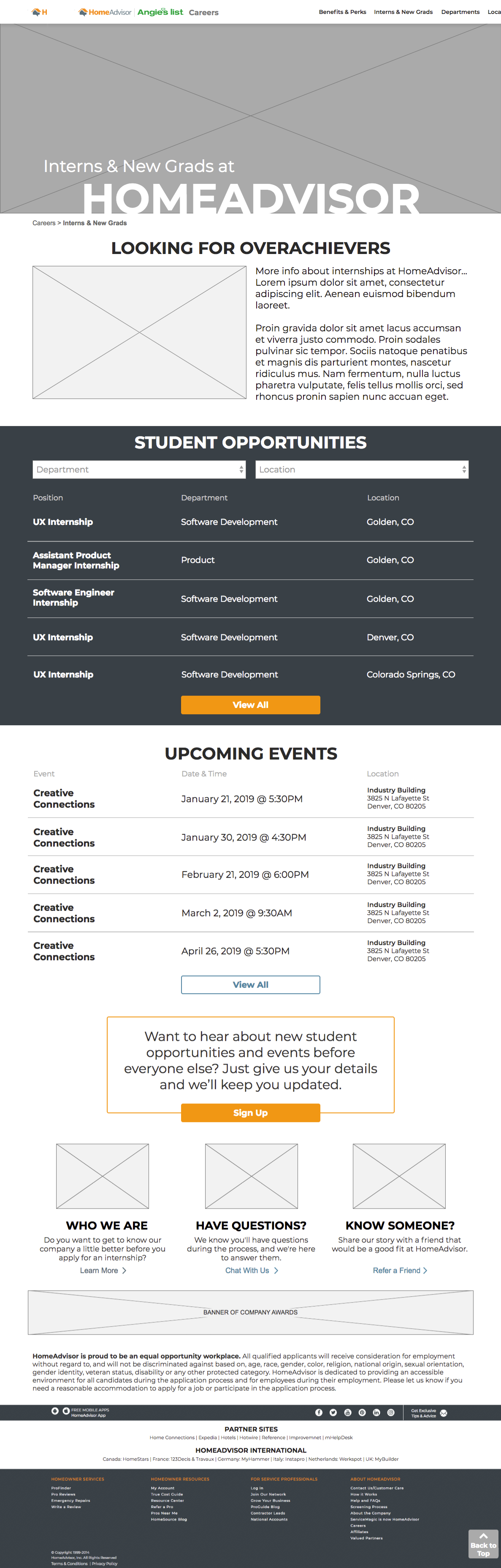
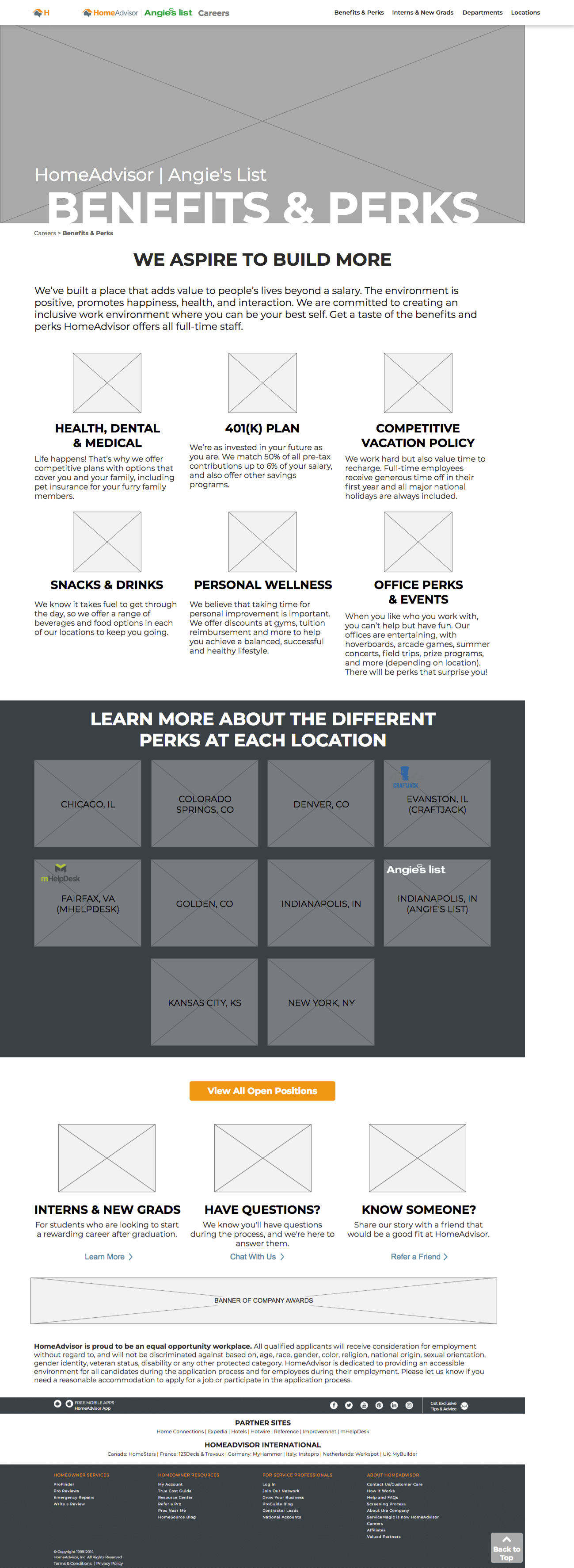
After presenting these wireframes with several departments and usability testing the prototype with a few employees, some key pain points stood out. A few of these pain points were:
“It’s confusing to have other brands within the locations section, without addressing it anywhere else.”
Several people questioned why we had the top nav branded with both the HomeAdvisor logo and the Angie’s List logo, even though the website seemed to be HomeAdvisor branded.
Having a HomeAdvisor Indianapolis location and an Angie’s List Indianapolis location was redundant.
“What if there aren’t any openings in a location, do you remove that location?”
My Solutions
After soliciting feedback, I started implementing changes that would help solve the previously stated pain points. The video below demonstrates how I adjusted the branding and more clearly separated HomeAdvisor’s subsidiaries from office locations. I also added a feature that would show the user how many positions were available, whether they wanted to search by location or by department.
This is the prototype I walked through with visual design for the design kickoff. The final version is currently in development.
“Zach has done an excellent job with his internship at HomeAdvisor, handling a complicated, ongoing project with scores of stakeholders alongside smaller initiatives.”
- Noah Ward, Lead UX Designer
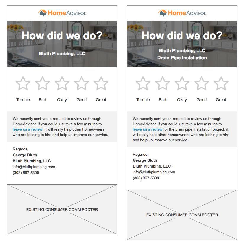
Pro Review Reminder Email

background
Service professionals (pros), who worked for HomeAdvisor, heavily relied on reviews to earn more jobs. Due to this fact, we needed to have another way to encourage customers to write reviews for pros who had worked with them. The reminder email would automatically go out to a customer who was sent a review request one week prior, but had not yet reviewed the pro.
The Challenge
The goal of this project was to increase the number of pro reviews by reminding a homeowner to complete a recent review request. It would apply to both open (meaning HomeAdvisor had not yet captured the customer’s project/contact information) and closed reviews and would help us in the goal to get more closed reviews too.
Design
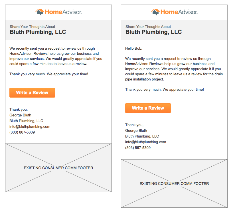
After being given the requirements, I designed a simple version of the email that referenced the old email template. I also designed a new template that we could potential test it against. You’ll see both the opened and closed review versions of these two different designs below:
A/B Test results
The project manager liked both versions A and B, so we decided to test both. After a few weeks of unmoderated testing, we reviewed the analytics and found a clear winner. You’ll see the comparisons for the control vs. tests A and B and the results of these tests, below:


"Test B is a clear winner and is statistically significant in terms of submitted reviews at the 1% significance level with a 9.1% increase to submitted reviews. This should be a big help in getting pros more reviews.”
- Kathryn Boswick, Project Manager
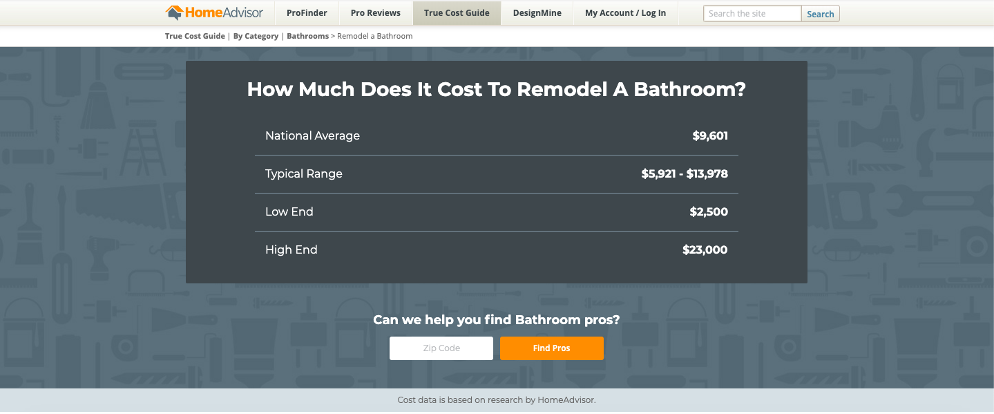
True Cost Guide

Background
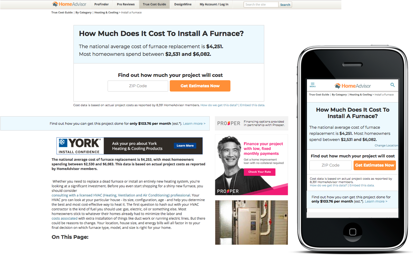
HomeAdvisor’s Cost Guide pages were created to help homeowners understand the possible extent of their projects, as well as the price breakdown of these projects. The page provides lots of information, including national average costs of their project and the ability to find their local averages. These pages are the highest trafficked pages on the company website, and a lot of traffic is driven to these pages from Google.
The Challenge
HomeAdvisor’s main goal is to increase conversion rates from users looking into the services to users clicking in to getting actual quotes from service professionals. The conversion rate was approximately 2.4%, but these pages were so highly trafficked that, “…any increase in the conversion rate would be huge” (project manager). As a secondary goal, we wanted to increase the search engine optimization (SEO) even more.
Research
Reviewing old tests and making new assumptions…
Some small adjustments had been done to this pages hero before, and they made the conversion rate drop. The project manager (PM) supplied me with all the old test pages and results, which helped me to better understand what went wrong with those as well as to help me make assumptions.
Assumptions:
People on this page are curious, but not committed to getting a pro right then. When they see the callout: “Contact a Home Building Contractor Today”, they skip it
They probably see the price average, etc., and that’s all they want even though they know it isn’t super accurate
They type in ZIP and realize that the “Get Estimates Now” button puts them in a whole new process they’re not ready for, so they bounce
When they see the callouts: “Get a Quote From a Building Contractor”, they think of how that may cost them to have a builder come out and quote it
Users like to do a lot of “shopping around” and research before committing to anything
Competitive Analysis
I looked into a few other home improvement and construction cost guide pages that other companies had design, to get a better idea of others’ conversion strategies. After looking into the old tests’ results, making my own assumptions, and researching what others were doing, I felt I could start wireframing some potential solutions.
Findings from other home improvement cost calculators:
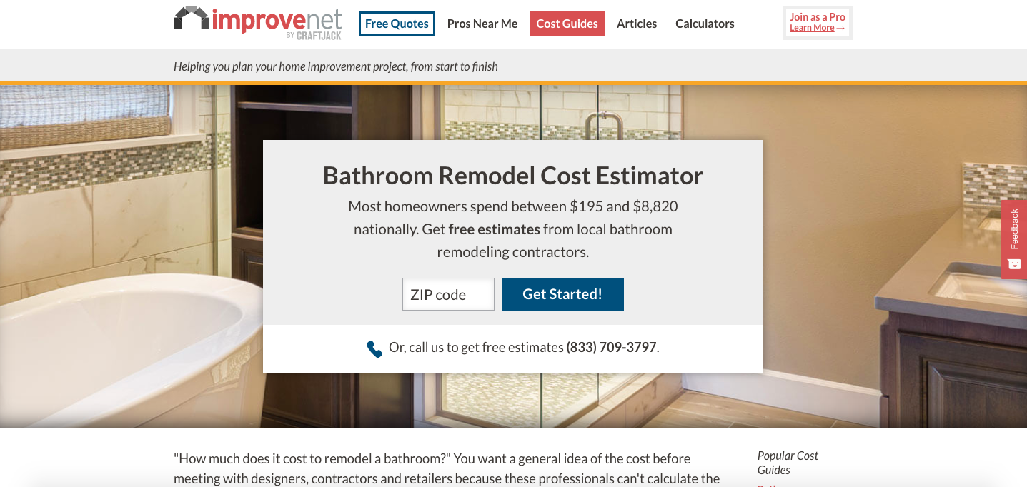
Improvenet allows the user to immediately see estimates for local costs, but also has the CTA with ZIP to go into their contractor quote process.
Their CTA says: “Get free estimates from local contractors for…”
They also have a bell-curve graphic further down the page and under it there’s a CTA that says: “Get Free, Detailed Estimates Now!”
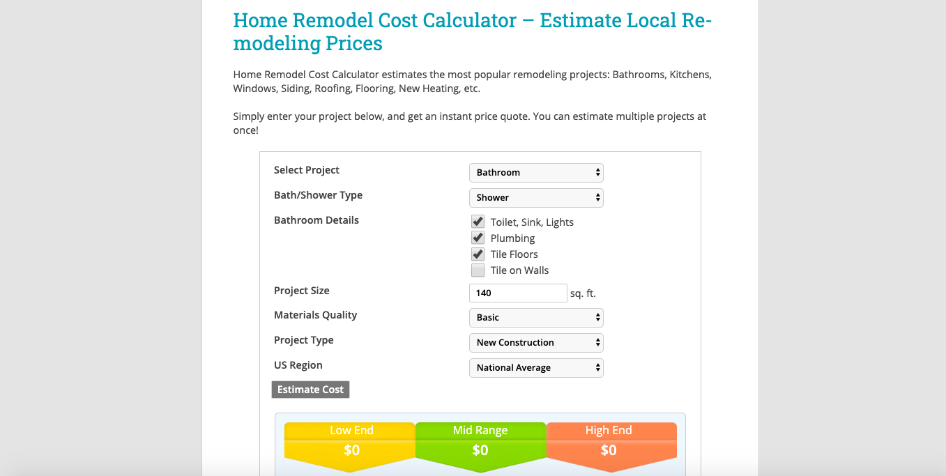
Remodelingcalculator.org appears to make the “Get Estimate” slightly hidden when trying to calculate an estimate, but have the CTA to go into their contractor quote path much easier to see. Almost seems to trick user into clicking it.
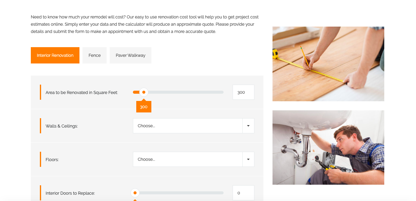
Homeimprovementkc has the user fill out a calculator form that dynamically updates the cost estimate and has a contact form directly beneath their estimate.
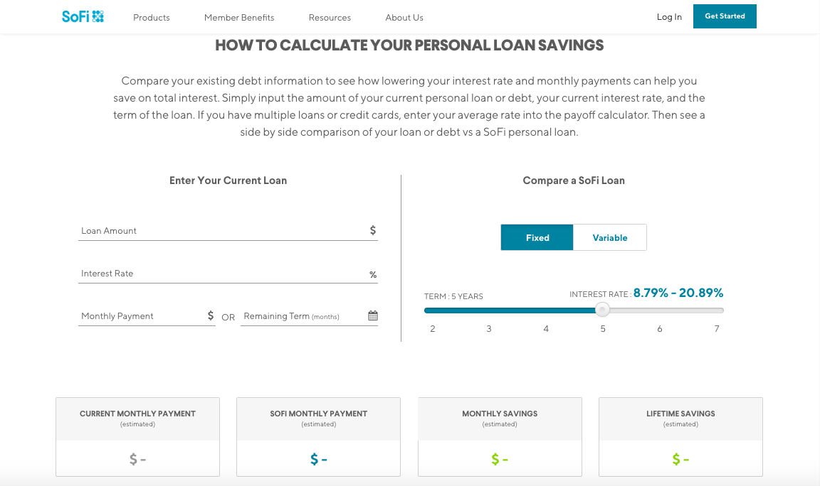
SoFi starts you out with very little info and completely calls out the CTA which pulls you into their wizard for getting an estimate.
Once you’re through the four-question process, it shows an estimate and a CTA for “Find My Rate”.
Potential Solutions
Give the user just enough information to attract them, but not so much that they feel like they’re satisfied enough to not get an actual quote.
Don’t include the location option for the estimate.
Add “free” into the estimate copy, so the user knows they wouldn’t be committing to anything major.
Design
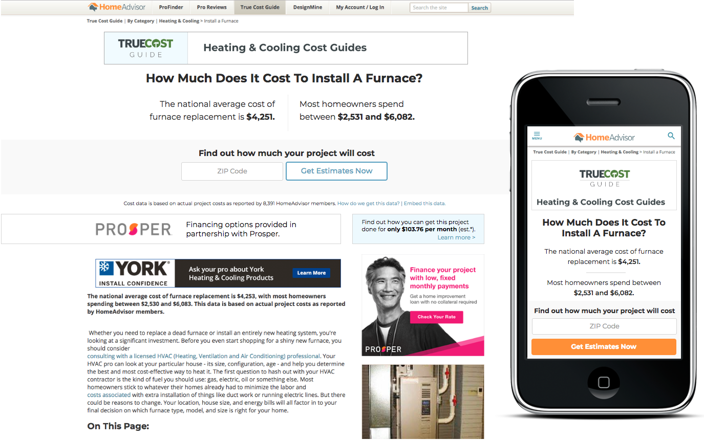
The PM also supplied me with a redesign they were working on for the True Cost Guide Categories page. This is a page that users could save their estimates to and visit from the Cost Guide page, so I wanted the Cost Guide redesign to somewhat match its more clean and modern style.
Mockups
Given that I was adding to a page that was already built out and the requested adjustments were changing the style to match the True Cost Guide Categories page, I designed several hi-fi concepts for the PM to choose from. Part of what I did with these versions was to remove the “Change Location” option from the header, to keep the focus on the CTA instead.
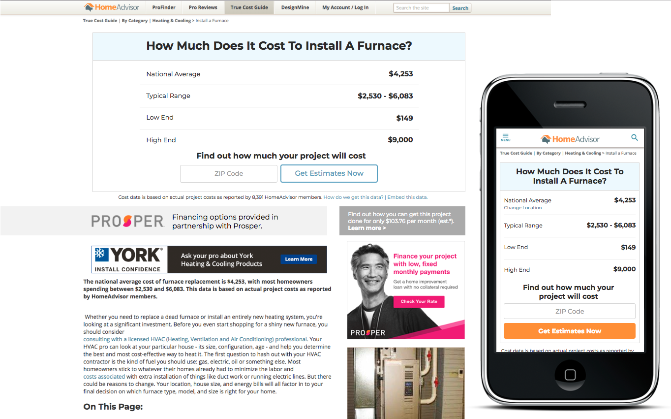
PM Feedback
Wanted to have the option to change the location and immediately see a location-specific cost breakdown, but potentially broken out from the hero
Try to add copy that has “calculate” in it or maybe even a calculator for SEO purposes
Narrow it down to the three best designs we should A/B/C test with
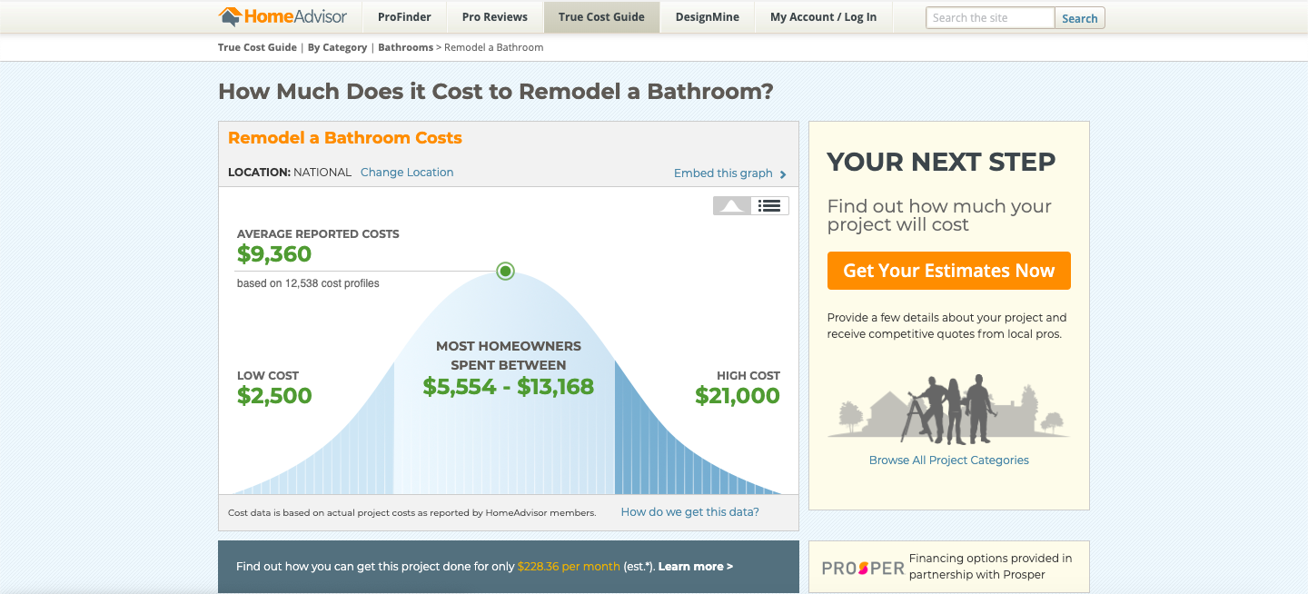
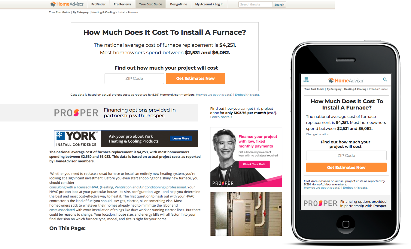
Round Two of Mockups
In this set of wireframes, I made a “calculator” that would appear just under the Prosper advertisements. My intentions were to give the user the option of calculating their local cost, but also having it turn into another “request for quote” CTA if they chose to calculate (attempting to increase conversions).
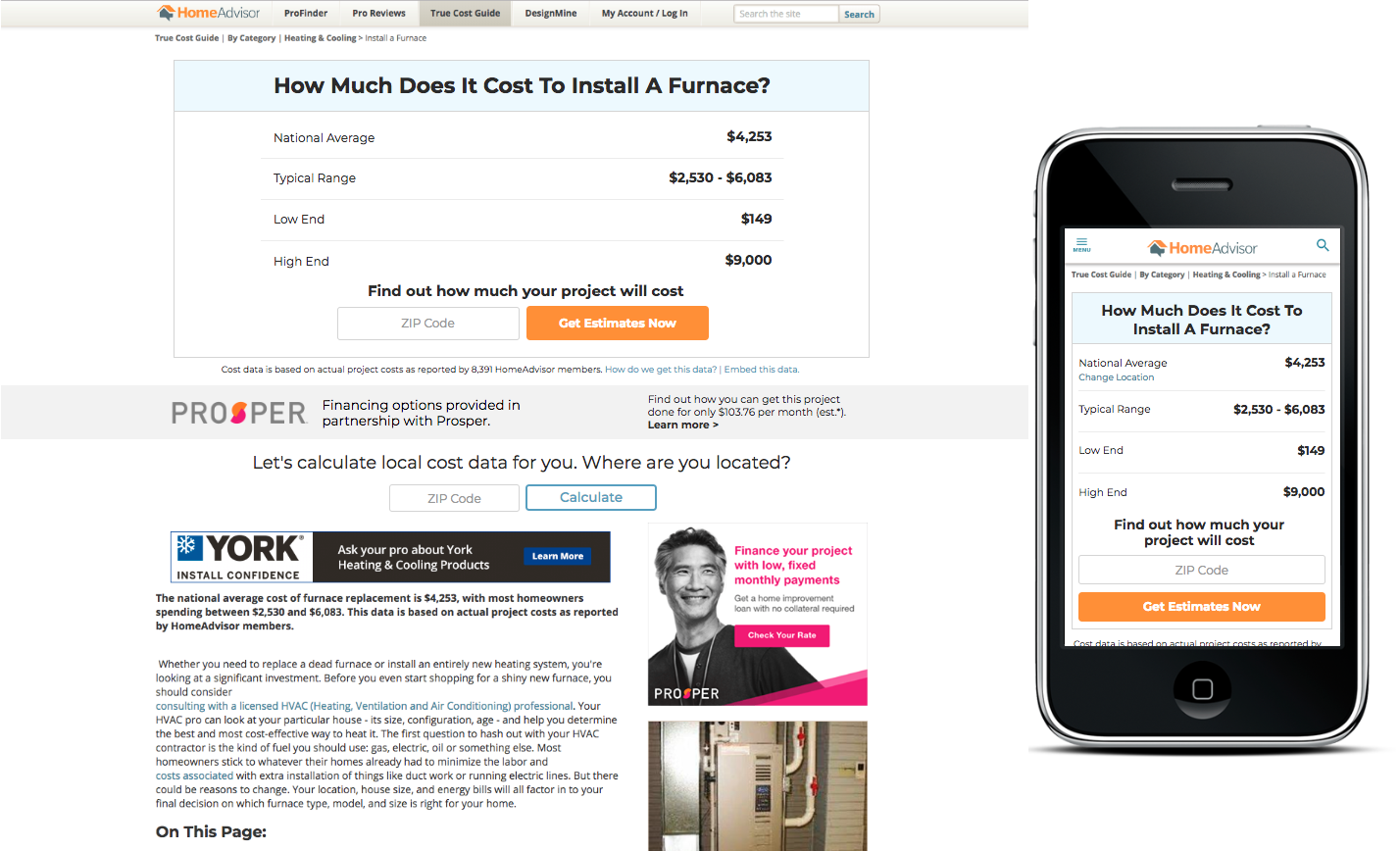
At this point, I presented to the PM as well as some developers and the SEO team.
Their feedback was:
Wanting to add a dynamic heading to the calculator for SEO purposes
Trying a sticky widget version of the calculator, so when users scrolled it would still be right there.
Trying to use a table somewhere to help for SEO purposes
prototypes
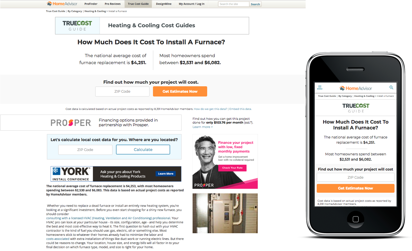
At this point, we had narrowed down the focus enough to create a few different versions for testing. I created interactive prototypes so the developer understood the UI and interaction changes, before building a few different versions to test. Below, you’ll see an example of one of the tested versions.
The greatest issues with this version was the complications of developing the sticky calculator, along with having both a sticky header and a sticky calculator appeared “overwhelming”.
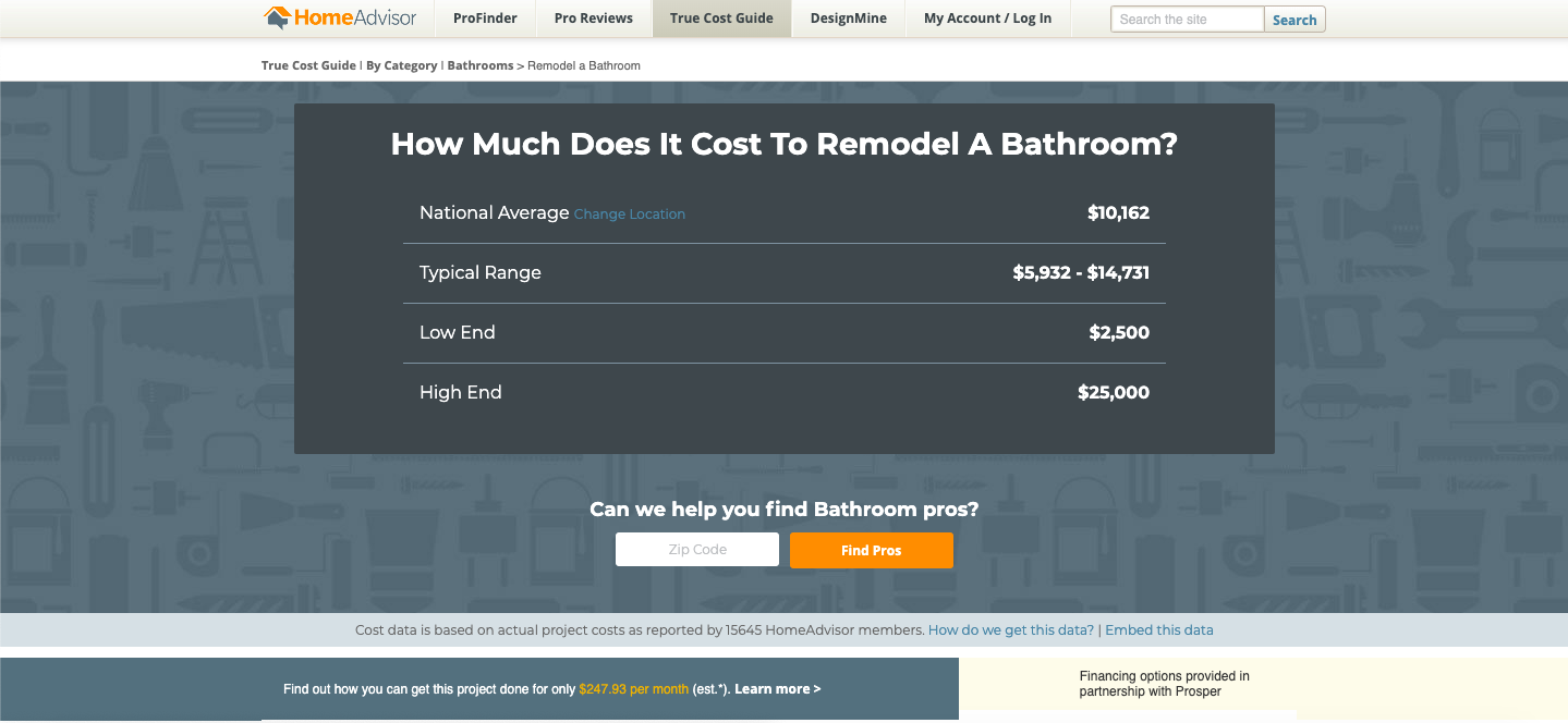
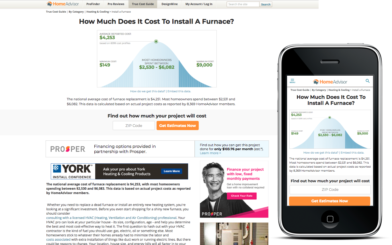
And the winner was…
The version that tested the best, for both mobile and desktop, was the most “straight-to-the-point” version. The hero image pointed directly at the only CTA a user could see, above the fold. It also separated the cost calculator from the CTA, and moved the calculator further down the page.


Desktop Version

Mobile Version