
Project: Pegasus
Company Background
Prescient is a startup that began as a manufacturing and construction company. They manufacture fabricated steel structures for construction of apartment complexes, student housing, senior living, etc. Prescient is moving into the technology space and becoming more of a software company.
The Challenge
Real estate developers need a more efficient way to research, finance, and orchestrate development projects. Developers usually take the greatest risk in a real estate development project and stand to receive the greatest rewards. They will benefit from mitigating some of the risk.
This brings us to the business goal of Pegasus. Pegasus is a SaaS product that attracts more people, from the real estate development industry to build with Prescient’s structural systems.
Full Steam Ahead!
in the beginning…
Our team consisted of a product owner, business analyst, senior UX designer, and myself (UX/UI designer). The senior UX designer had built several high fidelity screens to pitch Pegasus to investors. The software developers, in Poland, already started developing a product from these same screens. Some of these were screens were “pretty visuals” (like a dashboard) while others were based on some early interviews the senior designer did with real estate developers - our target persona.
doing my part
I immediately had to jump in to assist the senior designer with UI conventions and cleaning up the screens he already built out. At this point, I still have only a slight understanding of the business purpose of this product.
While working on cleaning up some of the UI, we found that Adobe XD was not a good collaboration tool. I began looking into alternatives. We agreed upon Figma, due to its collaboration capabilities and its similarities to Sketch (as Macs were inaccessible, so was Sketch).

We Need Processes
figuring out how all teams work together
Design was zero sprints ahead of development, so we had to crank stuff out just to give some runway for us to do actual discovery and research. I discovered that there was no formalized process for us to confirm completion: research, prioritization of features, design and development handoffs, or sign off. I setup meetings with development, the product manager (PM), and the senior designer, to talk about how we could better write and prioritize our user stories to maintain accountability for all parties involved.

Using the whiteboard to show how the ideal process would be for the lifecycle of each user story and showing how design and development could work together.
implementing ux design guidelines
Along with figuring out how all teams work together, we worked on how UX designers should name and organize files to better help development with understanding the workflows.

Working with the other designer to development a more consistent way of setting up designs for development to better digest.
Key Takeaways:
Lack of a formalized process results in rework by both design and development
Don’t assume because the company “uses” a product development tool that they really know how to use it
Whatever software you use to create and manage user stories, be sure to always assign them to people
Spec documents are more important to QA/QC than development, so don’t skimp on them if you think the developers don’t read them
Always take notes (and pictures of the whiteboard), even if it’s a spontaneous meeting, because it gives you proof of things that have already been agreed upon
Belated Research
trimming the fat
Since we finally got ahead of development by a few sprints, on Pegasus, I had some time to ask questions about priorities and why some features were included in the product roadmap. By creating a priority matrix and running a workshop with the product team, we discover that some items shouldn’t be worked on at that time, if ever. Some of these features were:
Scheduling assistant/calendar
Contacts management
Instant messaging
Dashboard (push to 2020)
Profile avatar (push to 2020)
Company creation and sharing (push to 2020)
Auditing/Card sorting
Removing unnecessary features gave me time to reassess the information architecture of the product and see what may need restructuring. I ran some in-person card sorting sessions with Prescient employees (who knew nothing about Pegasus) and some remote card sorts with real estate developers outside the company.


Early observations:
Navigation is too broad and shallow; things should be consolidated into more logical buckets
Multiple users saw no point in inbox/calendar tools
“Why are there links for help desk, admin settings, and system settings?”
As opposed to being separate, two users put both “Land” and “Building” under “Project”
Majority of users put “Amenity Spaces” and “Units” under “Building”


Users tended to group most their items into three high-level, task-based buckets:
Browsing for land
Drawing and editing a building
Creating a project with land, building, and proforma (definition: a method of calculating financial results to emphasize either current or projected figures) data
Proposed Sitemap
After affinity mapping and organizing my card sort findings, I then created a sitemap of the current state along with my proposed version. I first got buy-in from the senior UX designer. I then presented to both the product managers and the product owner. They agreed to it, and we were fortunately able to edit and reorganize before Pegasus had gone too far.
Before

After

Going Forward:
We were able to proceed with a navigational system that was lighter on both depth and breadth!
All the admin and settings links were consolidated into one, overarching settings link
The units and amenity spaces libraries were moved underneath the building library
competitive analysis
Up until this point, there had been very little research regarding software currently used by real estate developers. There had also been very little research regarding 3D design software. Fortunately for me, I love conducting competitive analysis!
I conducted pretty quick analysis for real estate development software because the majority of programs were pretty light and sparse. It still helped us gain some good insights for the property browsing features of Pegasus.

Real Estate Development Software Key Findings:
Most softwares had some sort of filtering mechanism called “opportunity zones”, meaning areas where there was higher demand for apartments, housing, etc.
Having a unit mix estimator, calculated by similar buildings in the area, could be a great differentiator for Pegasus.
Users may be more likely to favorite parcels of land rather than editing and saving multiple versions of them (as opposed to a 3D building model).
With 3D modeling software, there was a much larger pool of products to pull from. I mainly focused on programs that either were relatively light (given our target audience has little to no experience in 3D modeling), included building construction, or were browser-based (like Pegasus would be).
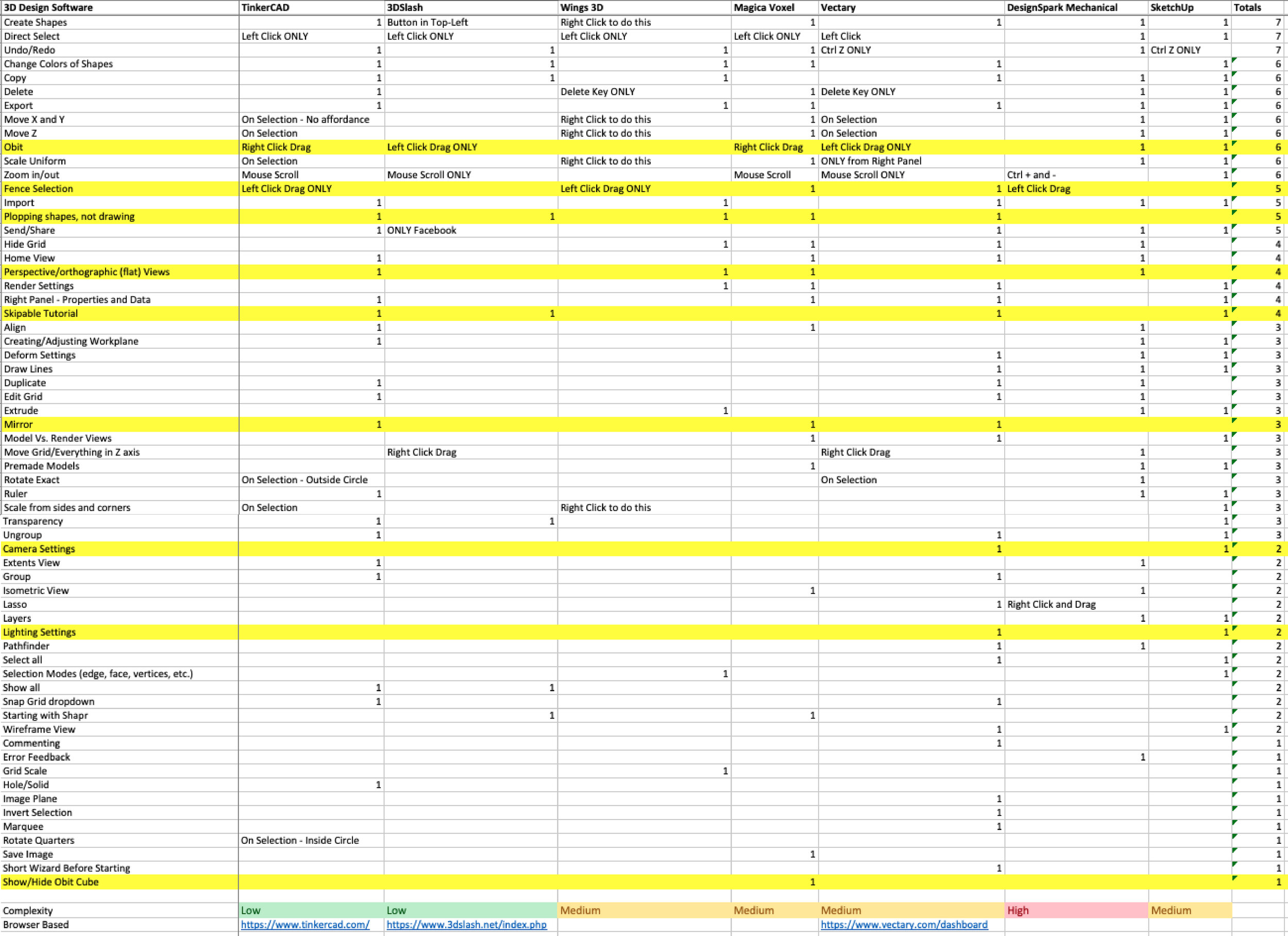
Key Findings:
Only one of the seven 3D modeling products had a view cube (in large part due to Autodesk currently owning the patent).
Right clicking and dragging in all applications was either moving the canvas or orbiting.
Originally, the senior designer wanted users to SHIFT+Click to select multiple items. I changed his mind when I showed him that the majority of other programs also had the capability of fence selection.
Simpler 3D programs didn’t have specific settings for lighting or camera.
IFC was the most common format for the BIM programs, specifically.
Design
Disclaimer - Due to the NDA signed with the company, I’m unable to show any designs of the actual product: Pegasus.Design System
I was originally supposed to build and maintain a design system; referencing what had already been designed for Pegasus. I started by auditing the other software products designed by Prescient. Here were a few of my findings:
All of them were internal-facing, as opposed to Pegasus.
Two of the products were developed with Kendo UI.
Another product, in the process of being built, was developed with Material Design.
Pegasus was being developed with PrimeNG.
There was no consistency with typography, buttons, etc., among all the products.
I started down the path of building a style guide, components, and documentation (from Pegasus screens). After struggling through this, while also designing new user flows, I soon realized that this wasn’t feasible for one designer. I spoke with our senior developer who assured me that building and managing a design system would require, not only a full time team of designers, but also a full time team of developers.

This was an overview of the original design system I started building; used to help inform other designers and developers on how it was organized and how to navigate it.
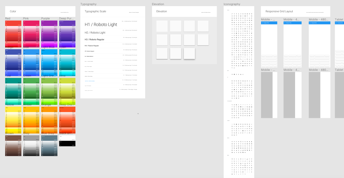
Moving forward with Google’s Material design
After talking with the designers and developers (and auditing Pegasus’s functionalities vs. functionalities within Material), we came to the conclusion that Google’s Material Design System was the way to go. It also helped that the other UX designer started to organize their components for Material Design. Him and I created a Figma library for all material.io’s components. Each product would then have their own theme branching off of the main design library. These pages also included any custom components; not directly mentioned on material.io.
We created stories in Aha! for each component, so we could keep track of the design and review from both parties before okaying each of the components.

We also had naming conventions for each component too; first by atomic structure, then element category, and then by element (example: Atom / Button / FAB). Below you’ll see some of the screens from the Material design library and some from the Pegasus-specific theme:


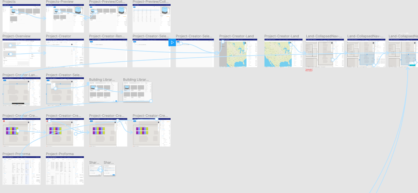
Redesigning workflows with the new ui
Once all the components were built, I started creating templates for each page in the navigation. From there, it was a matter of redesigning workflows; based on the (assumed) highest priority tasks for our users. I created thumbnails for different workflows, that showed there statuses (design, development, or “Done Son!”), in order to better show when a workflow was ready for development and should not be touched by designers.
The developers were still working through the technical debt from the old version of Pegasus, when I presented to them all the new components, templates, and workflow organization. By mid-January, the developers were ready to start refactoring all the old UI (PrimeNG) to Angular Material.
When it came to workflows, we started with the log in and account creation. After all, this was what users would start with when starting Pegasus. I then designed a “happy path” for a user logging in, reviewing a dashboard, and creating a new project; where a real estate developer could find a plot of land, design a building on it, and get a rough cost estimate from the combination of these two things. Since the software developers wouldn’t be able to work on these things yet, I figured I could try to conduct some quick usability tests…
Time for Testing
Usability Testing
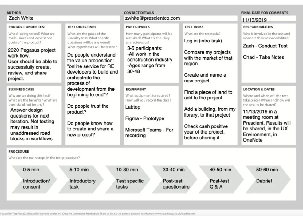
We didn’t have enough time to setup usability tests with our main persona (commercial real estate developer), but I was at least able to recruit a few folks within our company. They also had different experience within the construction industry; making them secondary and tertiary personas. I first created a test plan for what I wanted to test and who I would be testing with.
Usability Test Plan
Going into testing, I already had several assumptions, some of which were:
Users can successfully log in and understand where to click to create an account.
Users may find it confusing to compare multiple projects and markets at the same time.
Users know where to rename a project, within the project.
Users will understand the Google convention of clicking the hamburger menu to open and close navigation.
Adding land to project vs. adding land to the land library only may be confusing.
Previously saved land can be found, while in a project.
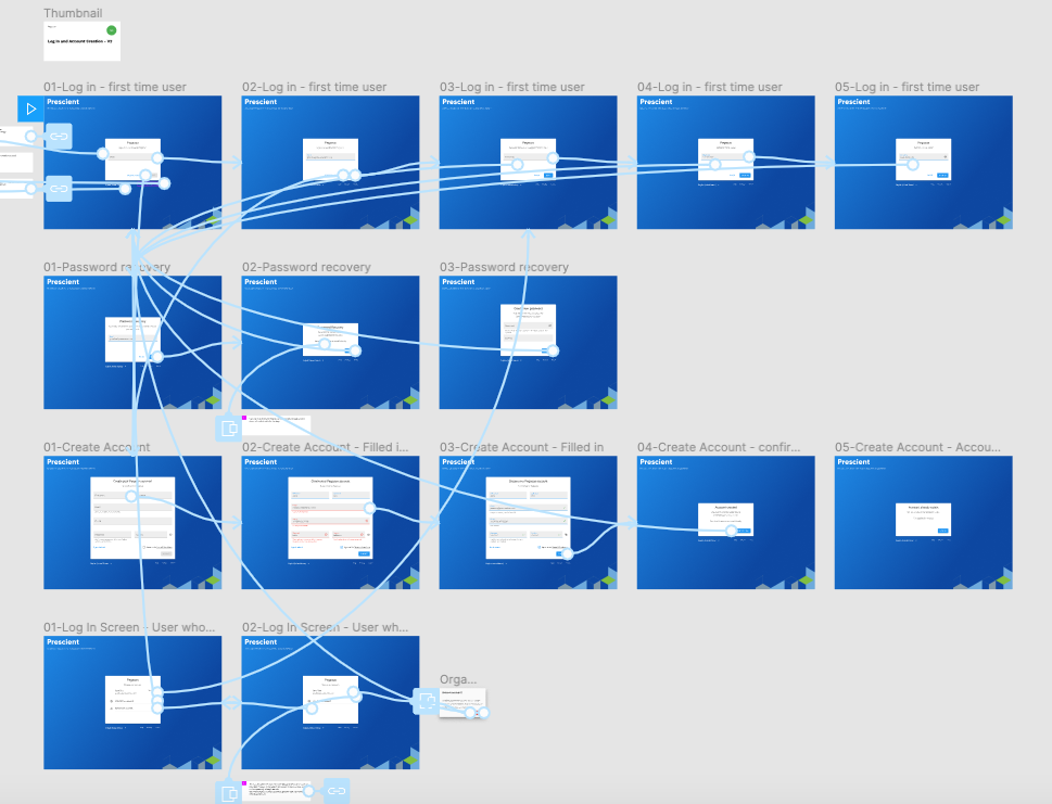
Usability Test Prototypes
After figuring out the areas I wanted to test, it was a matter of linking the relevant prototypes and making sure there paths were all logically connected. Once I was finished with this, I wrote the test script which walked the users through seven different tasks referenced below.
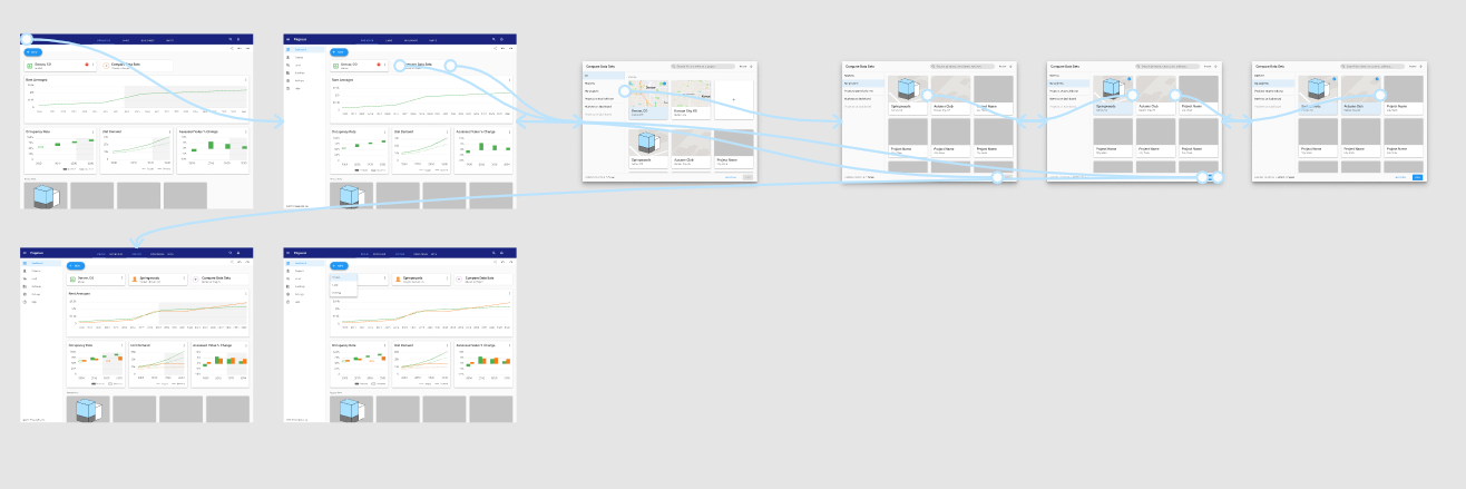
User Tasks
All seven tasks that, were given to the users, had scenarios tied to them and prompts for questions by the tester (myself). I won’t go into too much detail, but users were tasked with the following:
Log in - this was an intro task to give the user an understanding of how it works and hopefully make them more comfortable
Compare markets on the dashboard
Review project library
Create and name a project
Add land to project
Add building to project
Review proforma and share project
Organizing Results
The note taker and myself organized all the notes and I used Excel to organize my findings: ordered chronologically by task, color coordinated by number of users with the same pain points, and categorized by impact of those pain points.


Key Findings
The test identified three major, noteworthy problems:
Comparing different projects and markets, on the dashboard, were very confusing and created more questions than answers.
Being presented with the Project Editor when users selected “Create”, on the projects page, was jarring to all users.
The map icon was not understood among all users (supposed to change between satellite and map views).
In Conclusion
In January 2020, due to budget issues and goals of being profitable by year-end, the CEO halted all development on Pegasus. Though this was obviously not the ideal end for the product, it was still a great learning experience…
lessons learned at prescient
Talk to stakeholders before even starting work on a product, just to make sure they’re all on the same page.
Back up all your files for future case studies, just in case the company sweeps the rug out from under you.
No matter how much debating and historical data you have to prove something, sometimes you still need to put it in front of the person in contention. Have them try it to really understand why it provides a poor user experience.
A full-fledged design system requires very experienced designers and developers, working on it full time, to maintain it. If you don’t have that, use a design system that has already been made (and extensively tested), and you can always reassess building out a new one in a year or two.
Without at least one person in the “C-Suite” advocating for UX, it will be an uphill battle to push for more research.
Even a usability test with someone in-house, who isn’t your target persona, is better than no usability test.
Having at least some knowledge of the tool stack your developer is working in, will help immensely when working with them.